Franz Kraler
ECOMMERCE - UI Design - 2021
✺
Fashion and luxury in the heart of the Dolomites
PROJECT GOAL
Franz Kraler is a brand that over the years has built around itself an image that is quite distinct from that of its competitors, with an informal physical shopping experience aimed at creating a bond of trust and friendship with customers.
The goal of this project is to create an ecommerce site with a look & feel coordinated with the physical shopping experience and that recalls the elements of territoriality.
01
Research
1. Desk Research
2. UI Audit
3. Competitor analysis
4. Stakeholder interview
5. Visit to the store
02
Define
1. How Might We
2. Information architecture
3. Moodboard
4. Look & feel
03
Ideate
1. Typography
2. Color Palette
3. Icons
4. Design of boards
5. Prototype

01 . 1 - DESK RESEARCH
A method for defining a coherent digital identity
Before producing any material, it is good to understand who Franz Kraler is: his background, how he was born, his relationship with digital and what are the key words that distinguish this brand.
In 2015 Daniela Kraler said in an interview:
“... the e-commerce world is not in our interests. We believe that it does not marry with the human approach typical of our stores ...”
What is the triggering factor that led them to revise the position taken? What are their expectations, and what can we work on to make sure the digital experience mirrors the physical one? These are just some of the questions that emerged following the meeting.
01 . 2 - UI AUDIT
How does the current site work and how does it communicate?
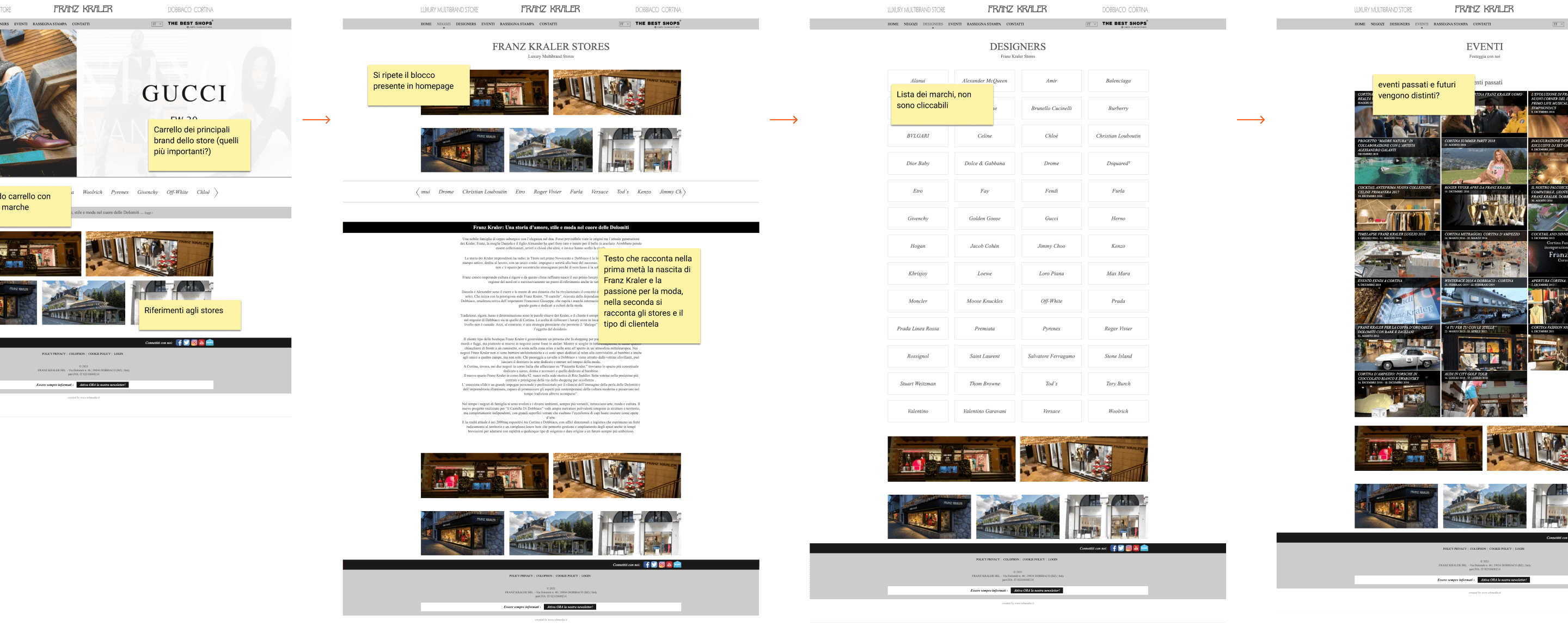
Another way to start the project is to analyze the current digital presence: website, social channels, video and photo communication, etc ...
In this case, we had a corporate site available that allowed us to collect additional information on both the brand and the type of communication adopted up to now; as well as the hierarchy and pace at which the contents had been shown up to now.
The most valuable material collected from these sessions are the analysis of the weak points, points that allow us to understand which are the errors to avoid and which are the points that can be improved for the new design of the site.
01 . 3 - COMPETITOR ANALYSIS
What are others doing?
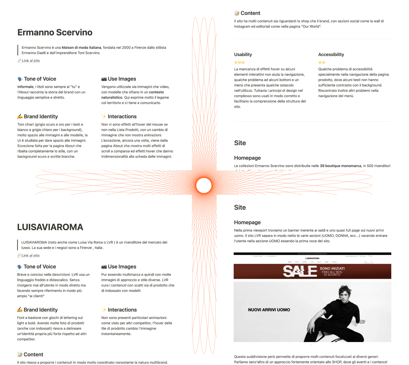
We have entered the project, we are becoming familiar with the customer and gradually discovering what are the aspects that distinguish this brand, but a good way not to stay focused and open up to other suggestions is by analyzing the other competitors, direct and indirect, to understand also how the user is used to approaching these.
For this activity I collected 15 competitors, 8 of these were selected on which I explored various points, following a template that helped me to be clear: Tone of voice, use of images, brand identity, interactions / animations, content, usability, and accessibility. Then analyzing the main first level pages and those oriented to the shop.
01 . 4 - STAKEHOLDER INTERVIEW
A few questions for the Kraler family
Before meeting them at their headquarters in Dobbiaco, we prepared a very short line of questions. The intent was to proceed with a semi-structured interview in which to collect the design requirements by following a series of questions that allowed us to stay on the topic of the interview.
In addition to the collection of requirements, it was also a way to enrich and better define the part of the research done previously, collecting ideas and material that could not be found online.
01 . 5 - VISIT TO THE STORE
Create a link between physical stores and the digital experience
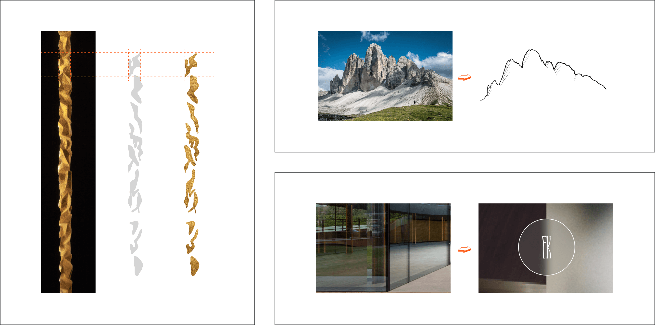
Franz Kraler's is an iconic brand that owes its recognition to the strong bond with the territory and the Dolomites. Surely, in our case, one of the design challenges was being able to transpose the elements of style that distinguish the physical shopping experience in the store, adapting them and making them as fresh and original as possible.
Many shots were taken inside the spaces, which allowed us to collect visual elements (such as the play of lights on the rock walls) and materials (such as the wooden and hand-wrought iron displays)
02 . 1 - HOW MIGHT WE
Let's join forces and explore new opportunities
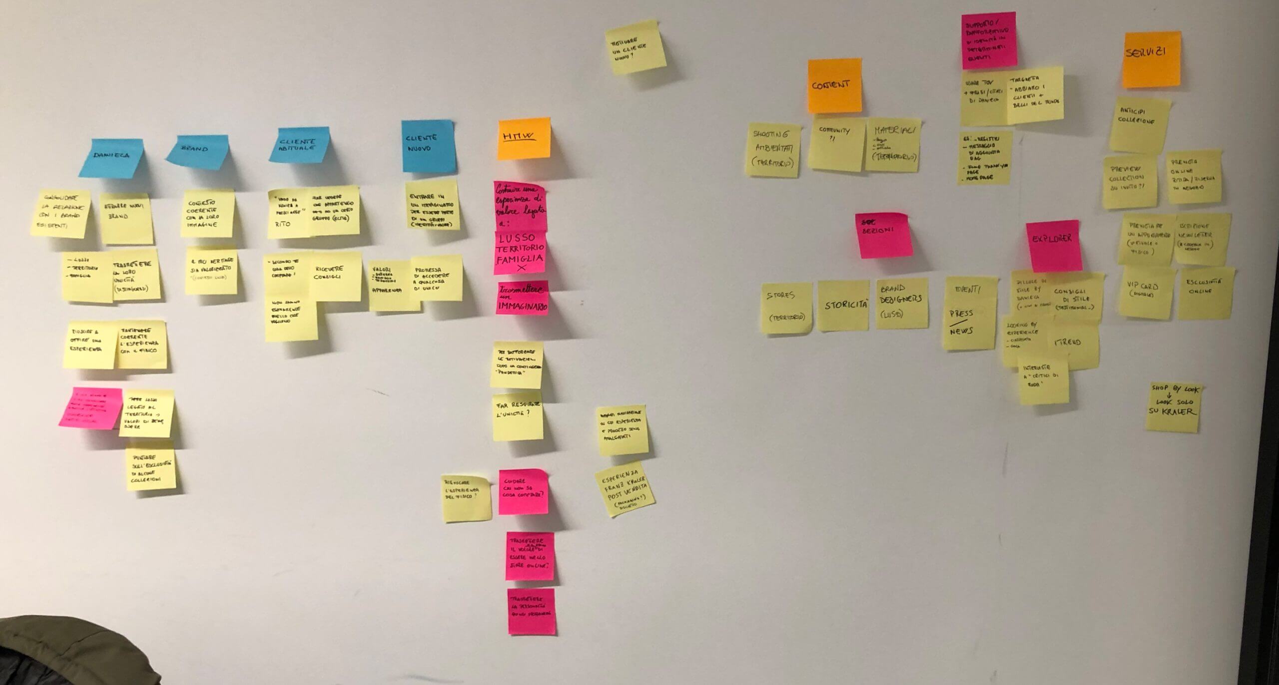
A 4-hour sprint without interruptions, completely immersed in all the material collected to investigate what could be the design opportunities.
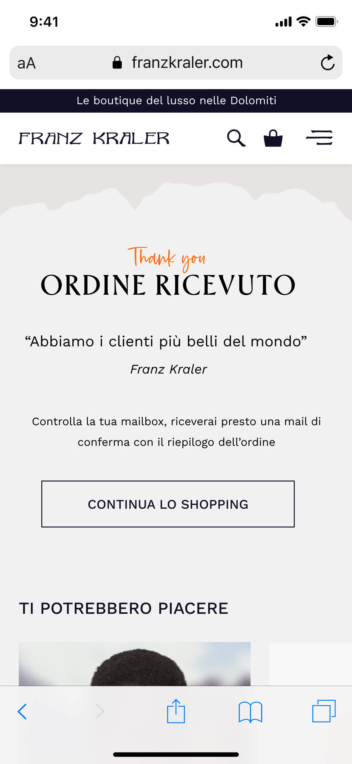
We understood that Daniela Kraler is a very important pivot on which the Franz Kraler experience revolves: “We have a plate placed above the tills of our shop that says 'We have the most beautiful customers in the world', and it's true, those who come to our shop are friends, with whom we bond a lot, and we want to be felt all our warmth “.
The ecommerce site also needed to have this informal and warm approach. We opened up to many possibilities, also probing aspects not strictly related to digital e-commerce: such as the experience of unpacking the order once received by the customer.
02 . 3 - MOODBOARD
Here we found out how bold Franz Kraler was
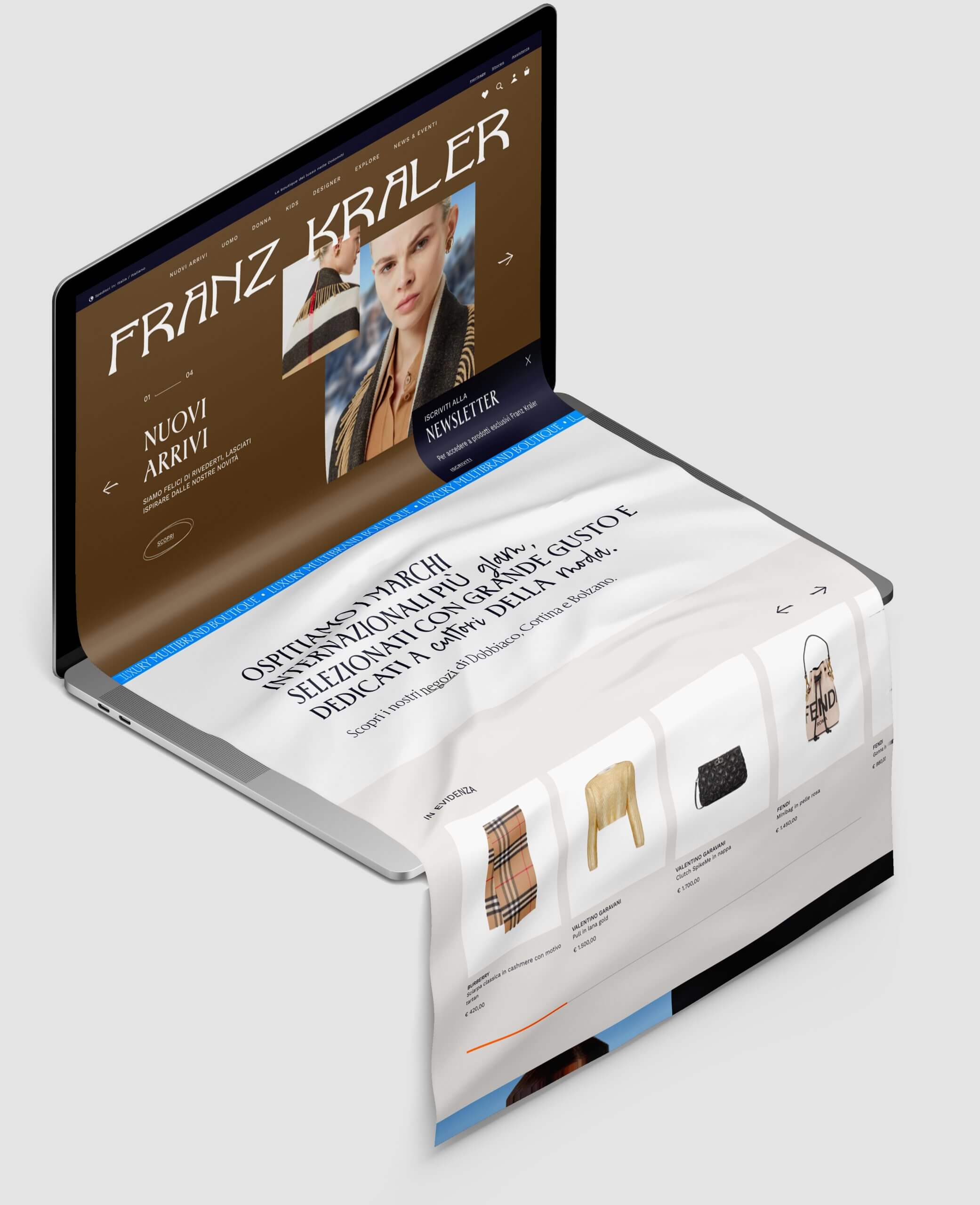
Both were very valid, one turned to brighter, more lively colors, taking up the neon lights that inside their shops contrast with the wrought iron and oak wood displays, with posed set shots that changed according to the landscape. The other, on the other hand, predominated in the harmony of soft, warm and pastel colors, with soft combinations of grays and beiges that were combined with still life shots with a monochromatic background.
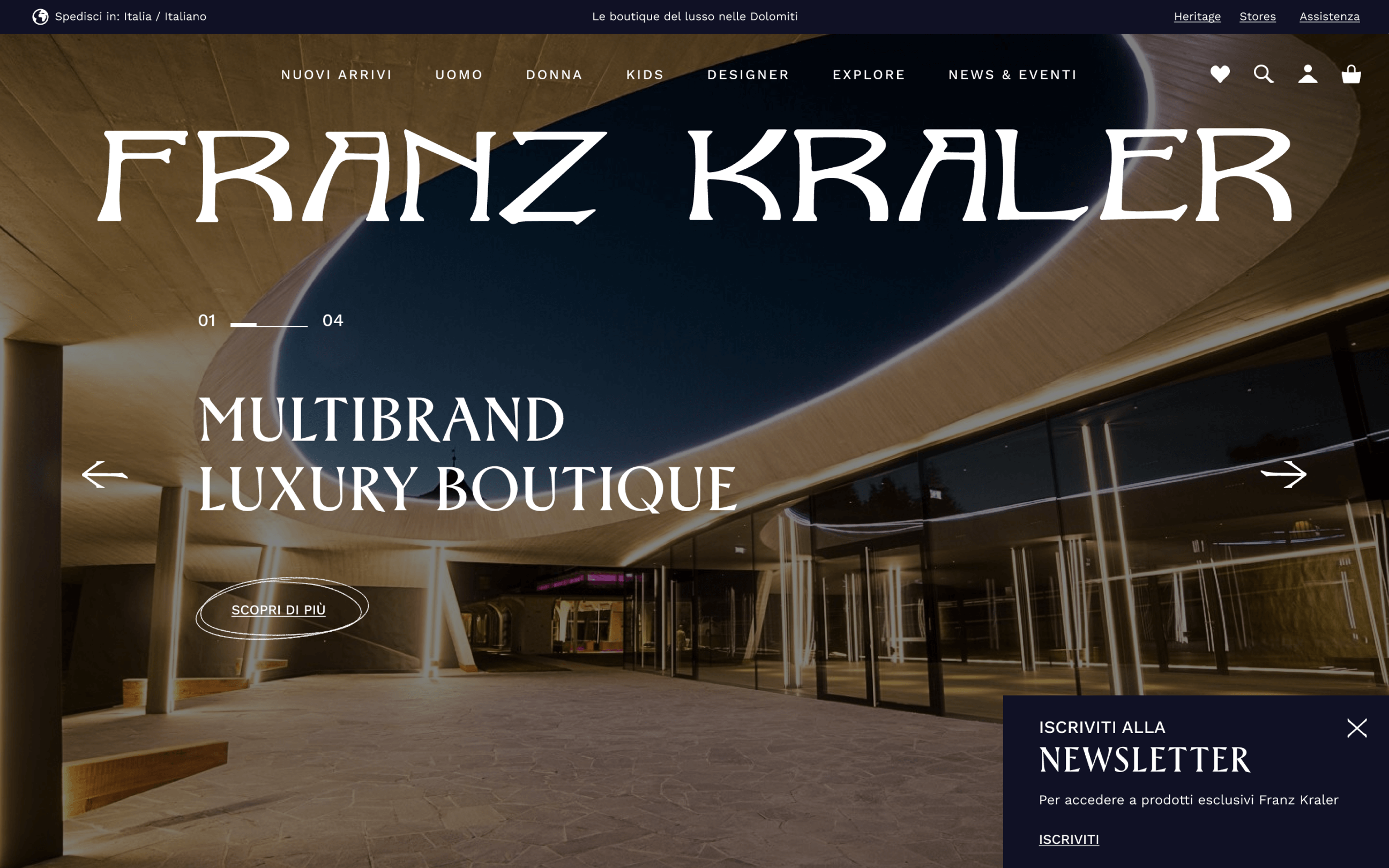
BIGHERO IN HOMEPAGE
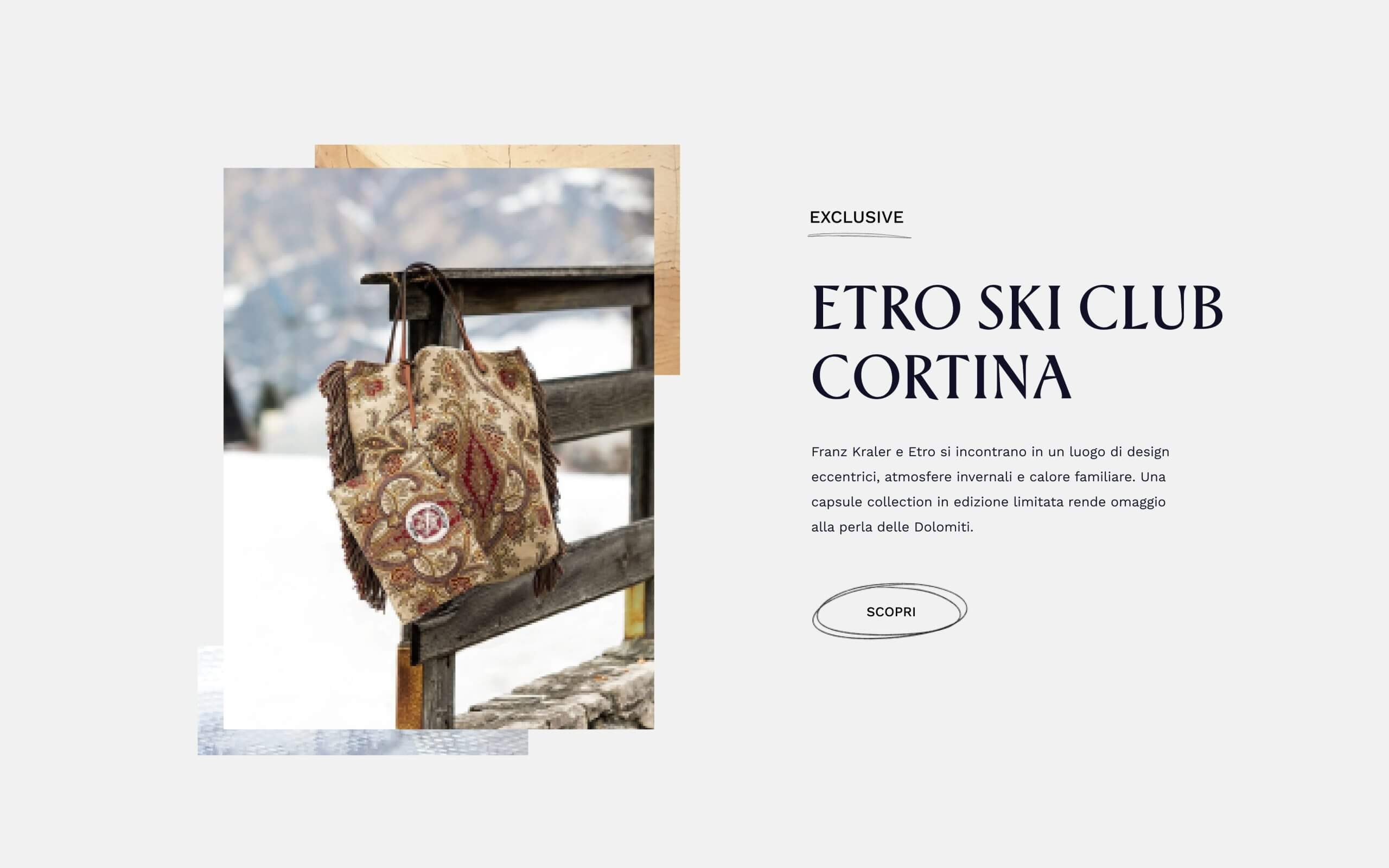
EDITORIAL WIDGET
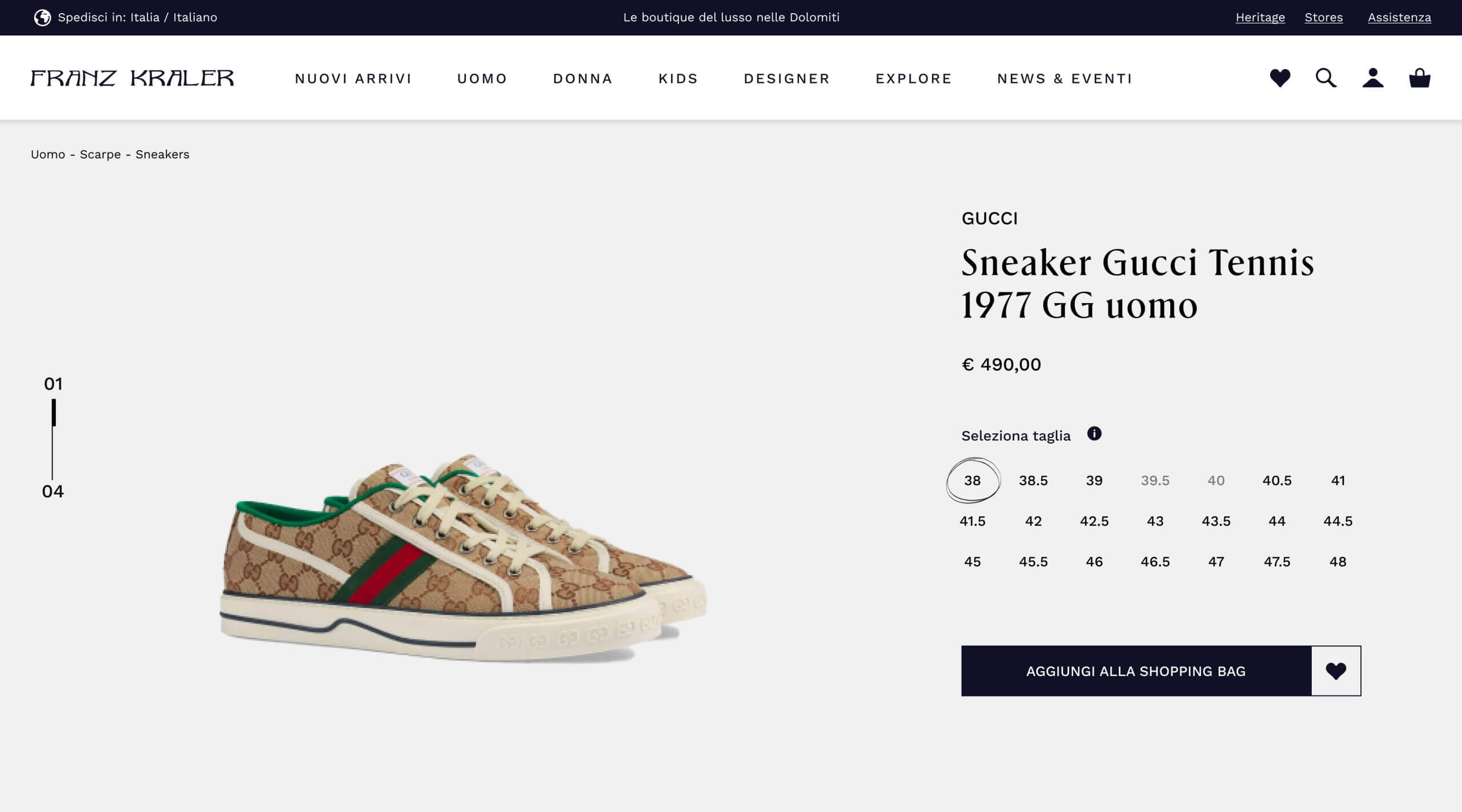
PRODUCT PAGE VIEWPORT
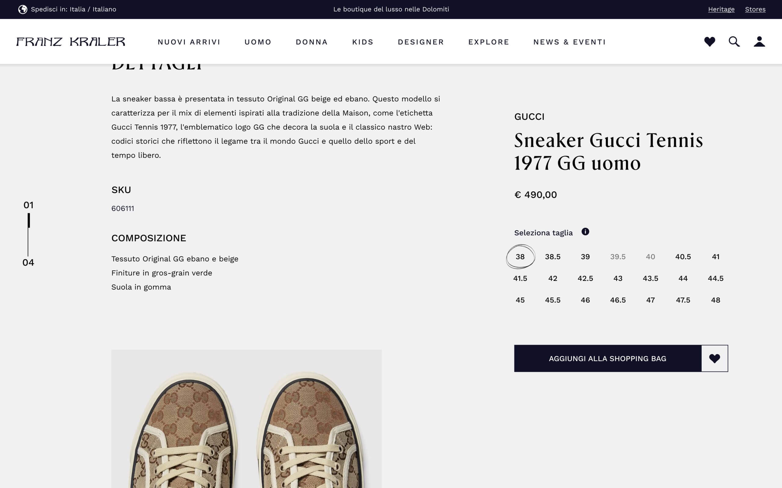
PRODUCT PAGE SCROLLED
03 . 4 - DESIGN OF BOARDS
We have worked down to the smallest details
Declining icons that recalled the style of the Franz Kraler logo and using a palette that could lend itself to the heterogeneous nature of the store (being a multibrand) with the use of shots that change according to the season and the brand in which we landed on the page. A design therefore in support of the images but with, at the same time, a well-defined and recognizable general style. Thus distancing ourselves from the competitors we have previously analyzed.
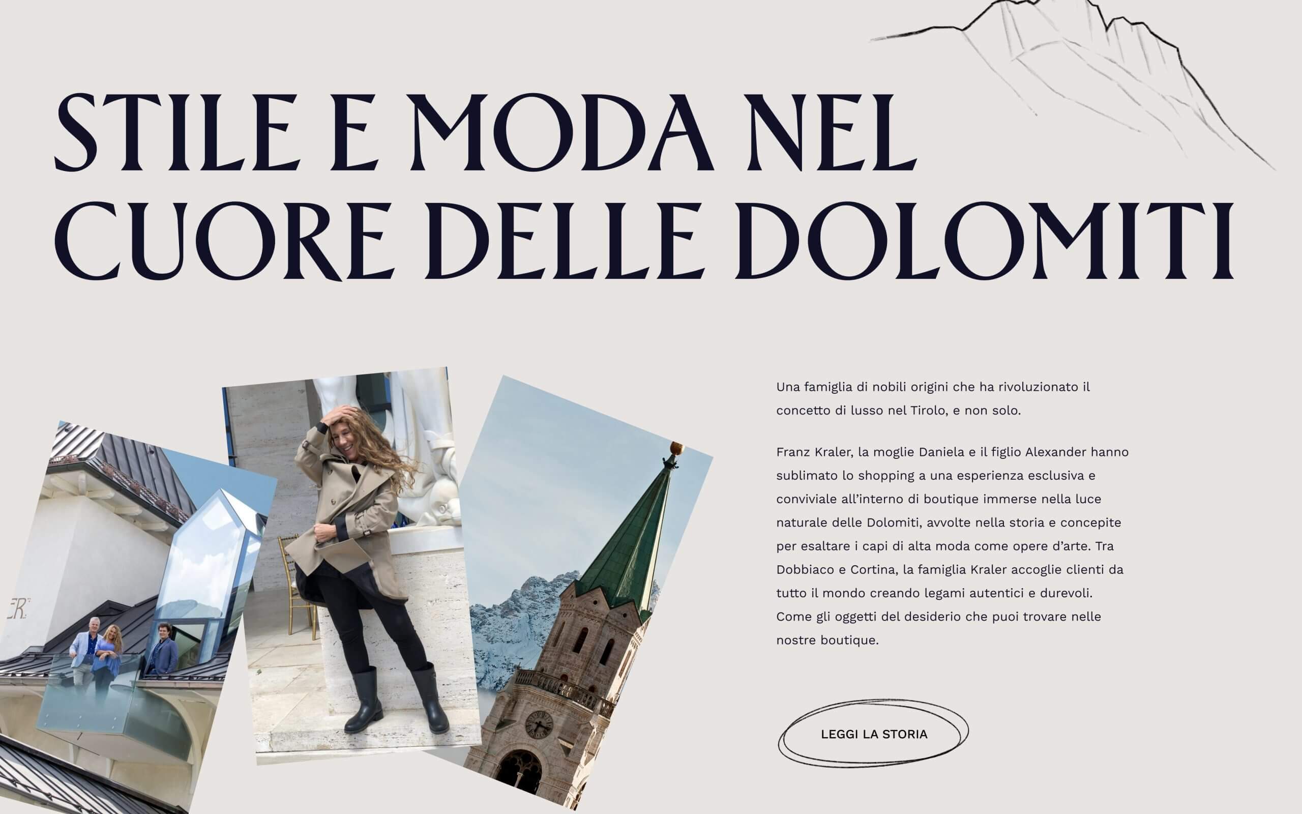
HERITAGE WIDGET
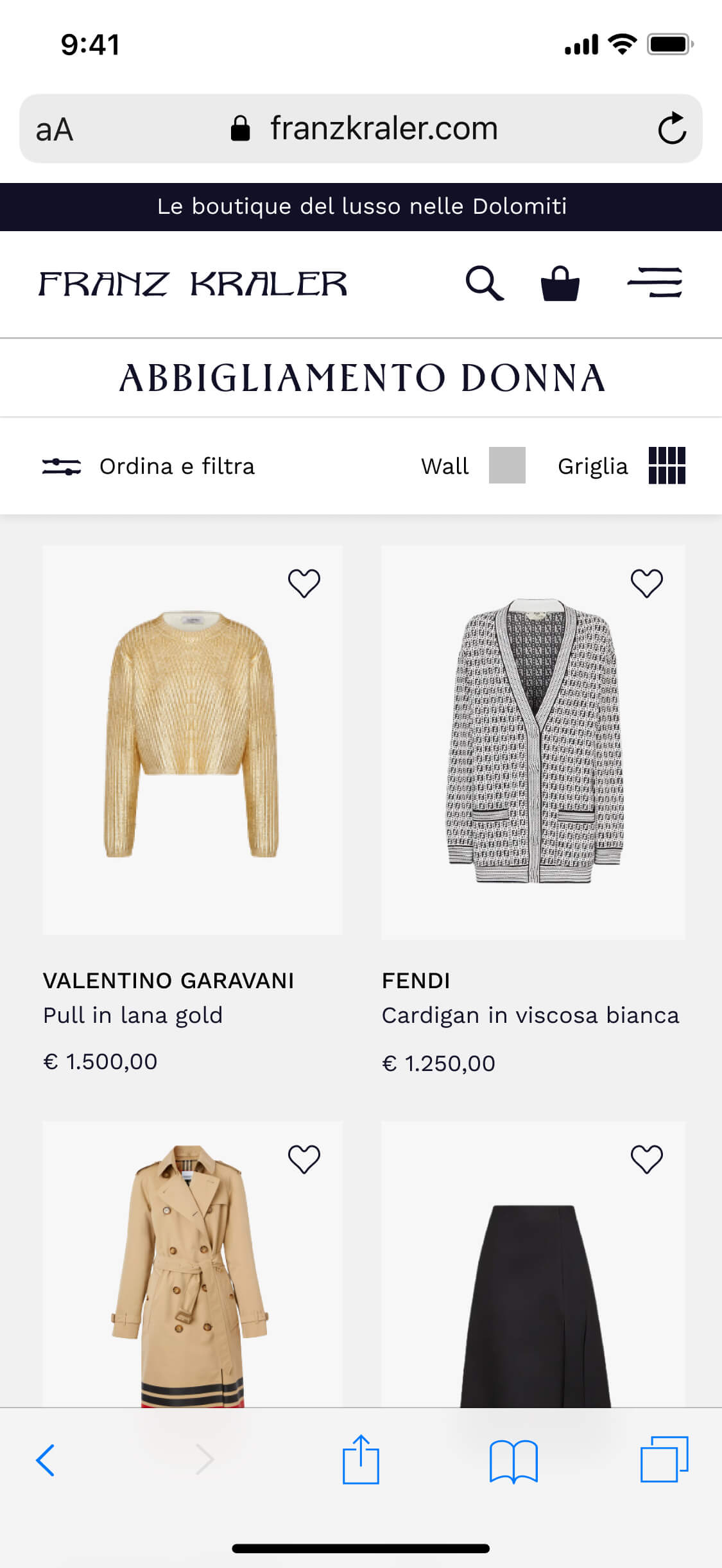
PRODUCT LISTING PAGE
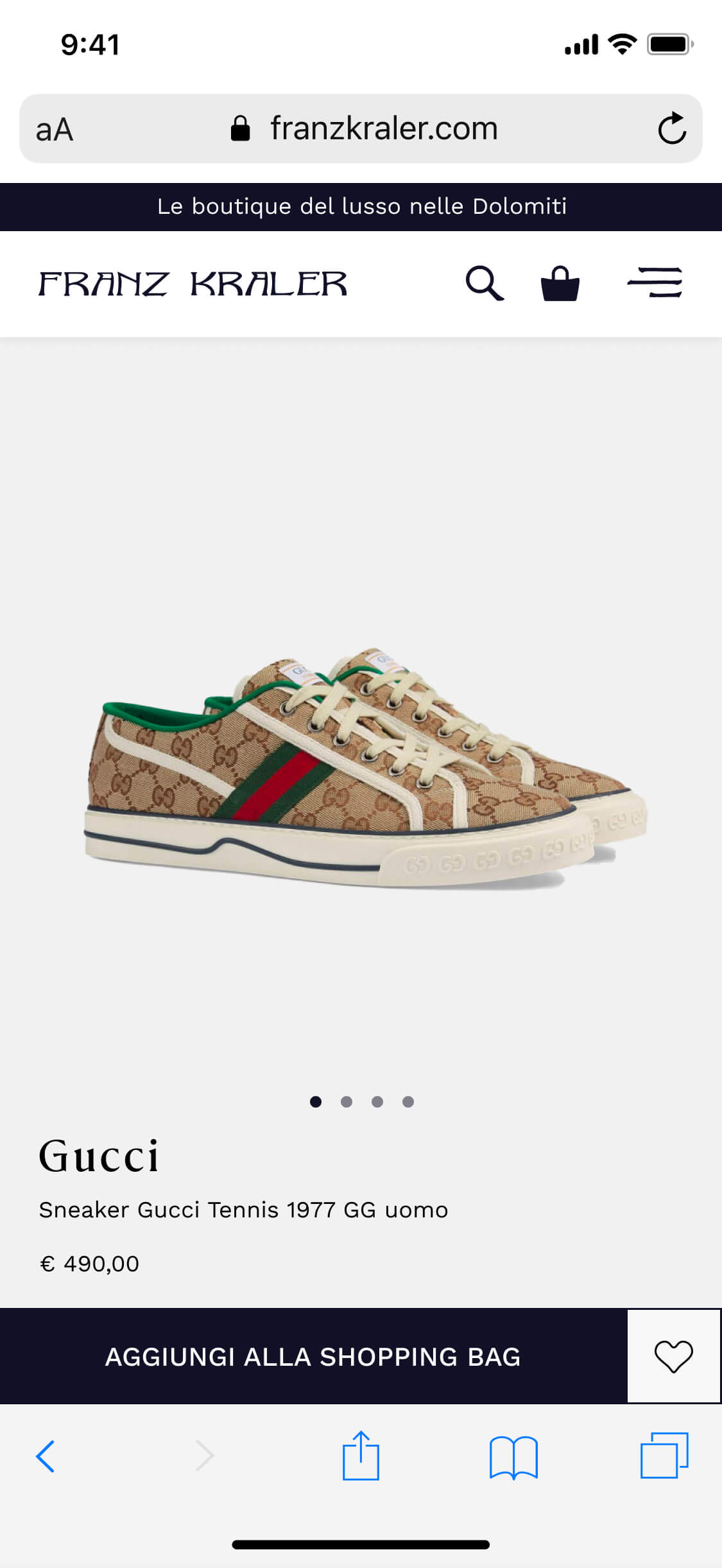
PRODUCT PAGE
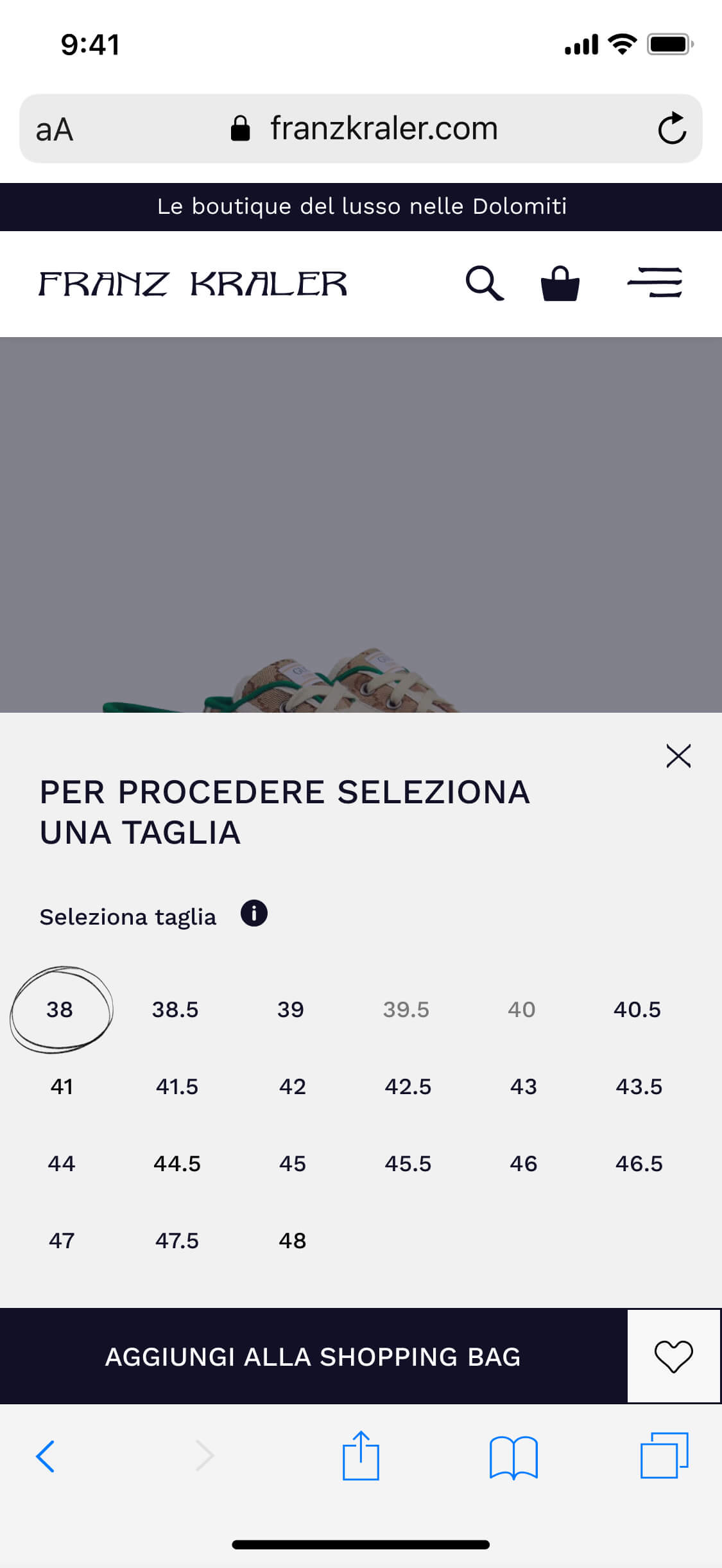
ADD TO BAG STICKY
03 . 4 - DESIGN OF BOARDS
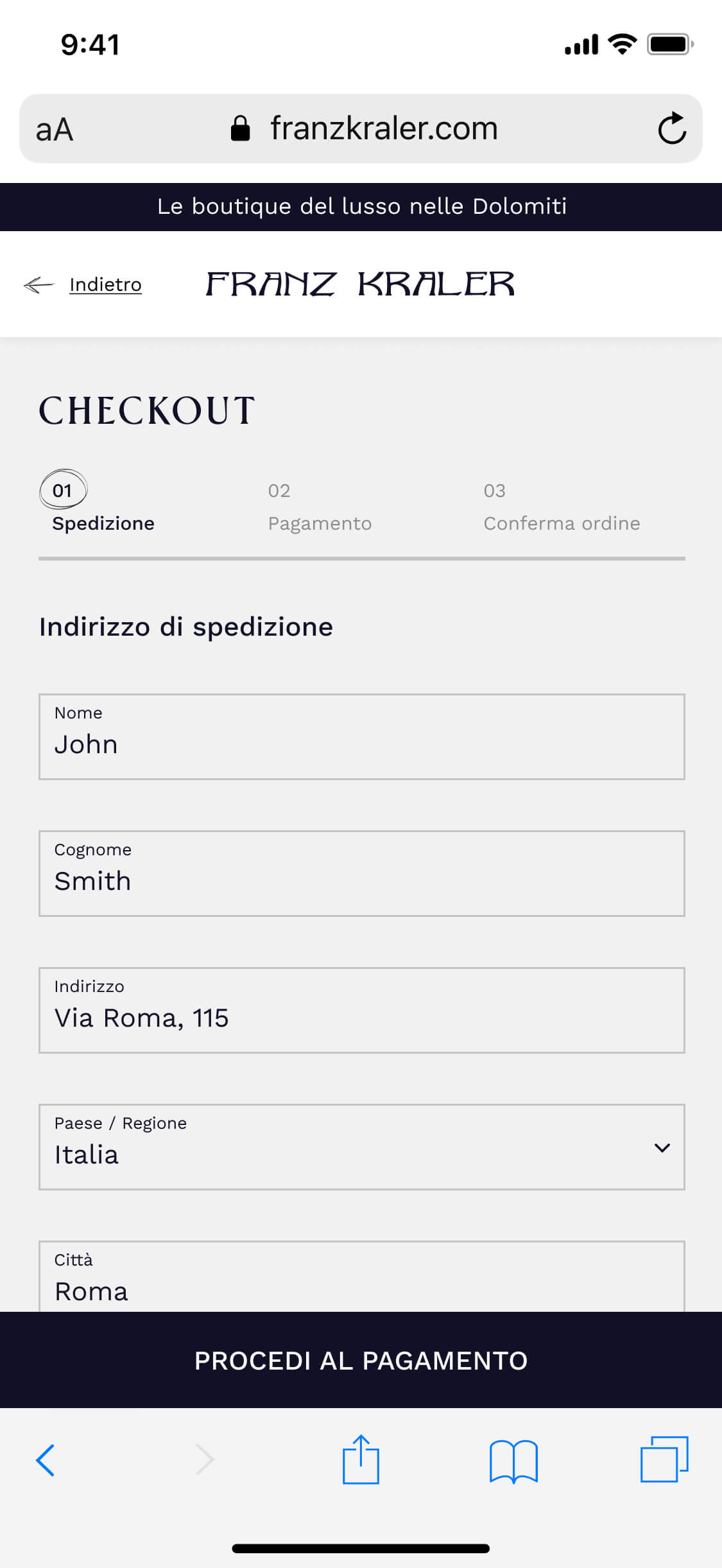
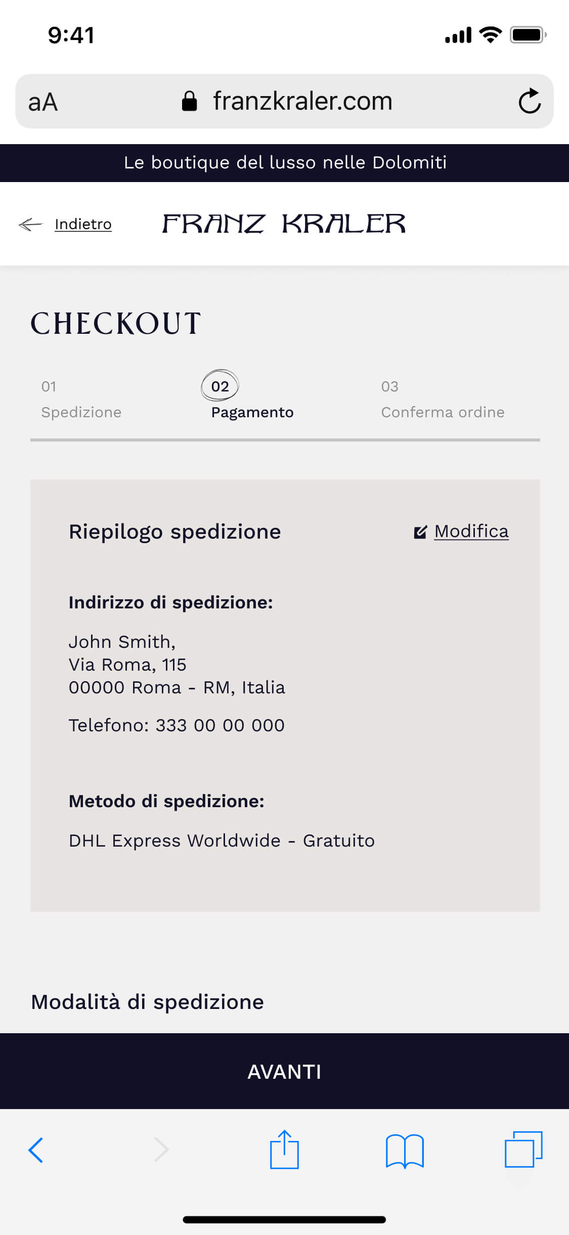
Also including some references to the physical store
For example, the plaque at the checkout mentioned by Daniela Kraler in one of the meetings, which we decided to insert at the end of the purchase flow. We are sure that this will be a detail that will make more than a few customers smile.
🙌