My Cicero
MOBILE APP - UX/UI Design - 2020
✺
Redesigning an app following the Design Thinking process
OBIETTIVO DI PROGETTO
MyCicero is an app for the purchase of tickets for public transport and for parking in paid parking lots. This case study is a personal redesign project that stems from the need to put into practice what has been learned so far in the Design Thinking course at the Interaction Design Foundation and to tangibly verify the progress and new skills acquired.
And being a 0-budget project and without the support of a design team, one of the biggest challenges I had to face was precisely to work independently to achieve a result that was highly qualitative. Addressing the challenges and limitations normally encountered when undertaking this type of project.
01
Empathy
1. Desk Research
2. UI Audit
02
Define
1. Proto Personas
2. Empathy Map
3. User Journey
03
Ideate
1. User Flow
1. Sketch of multiple solutions
04
Prototype & Test
1. Prototype
2. Test
3. Visual Design
01 . 1 - DESK RESEARCH
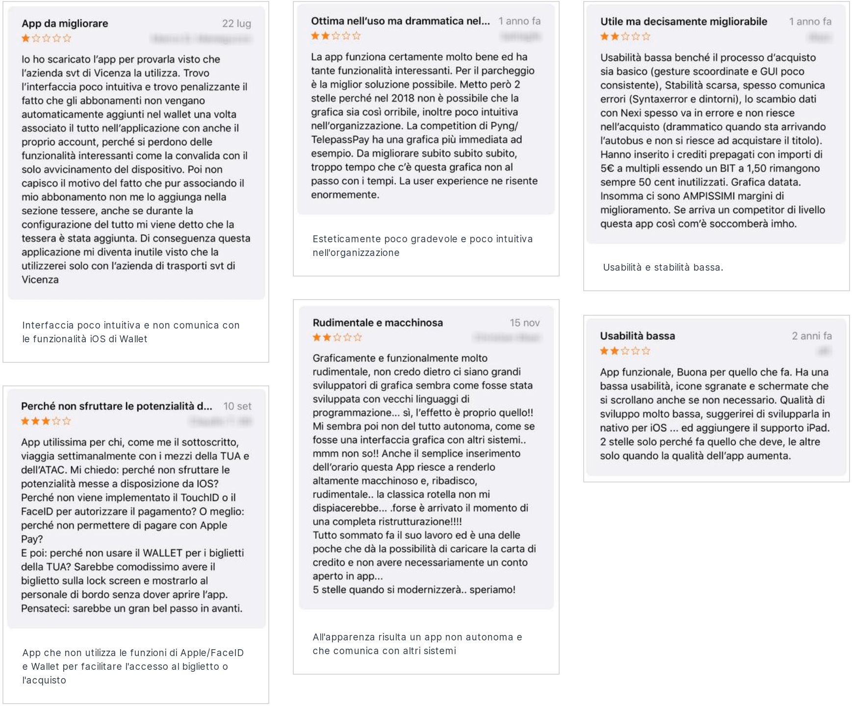
What do users say about the current product?
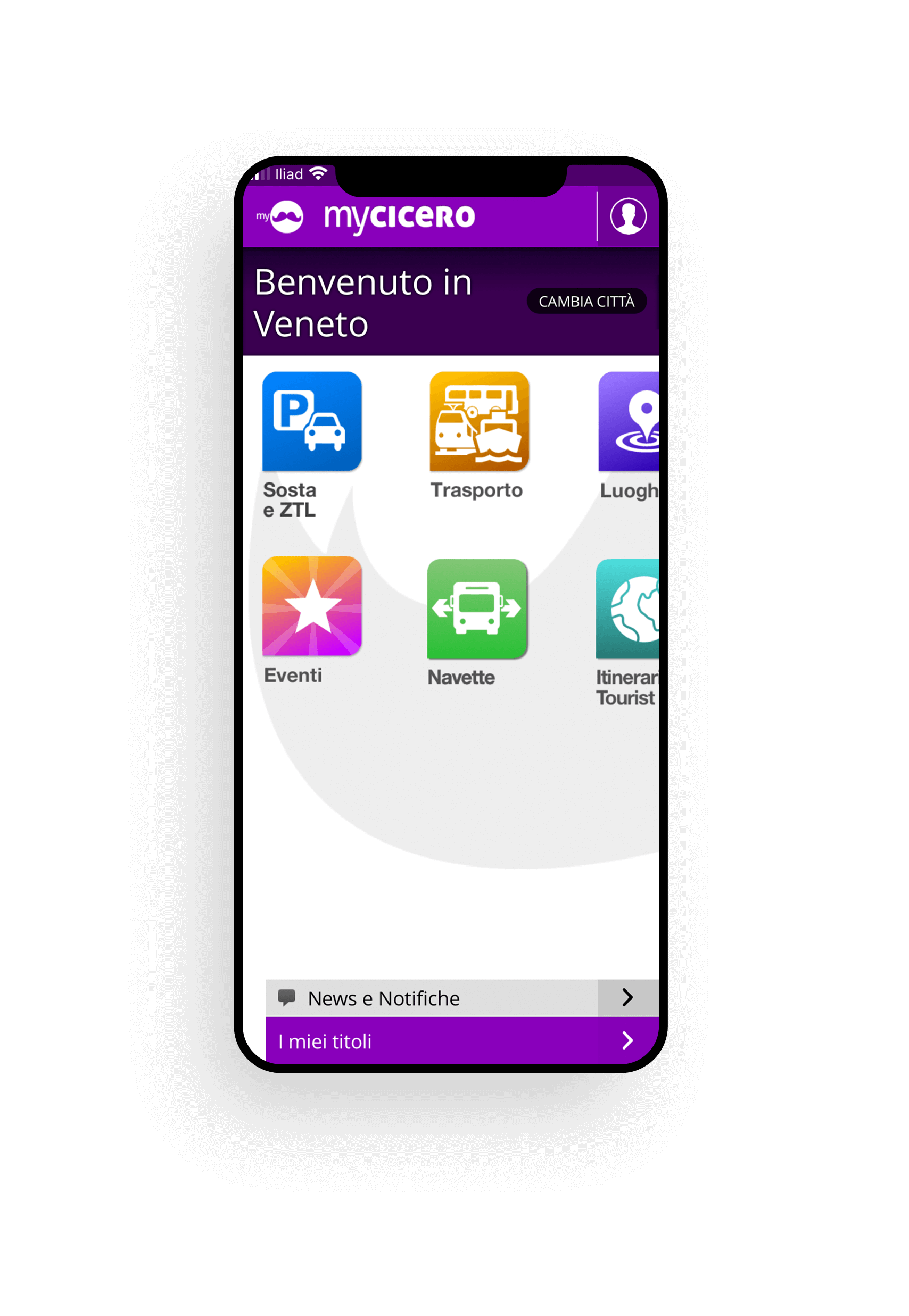
Being an app already released, it was easy to collect the first information from the App Store. In fact, it was valuable to analyze the reviews left by users and to be able to understand what the main frustrations were. Many of which had many points in common with each other: such as, for example, the unintuitive interface, the lack of integration with wallet systems, or even the aesthetics that are overall unpleasant.
01 . 2 - UI AUDIT
What are the current usability issues?
As a designer, I decided to carry out an app usability assessment by testing each function. By rattling off each small part, I was able to identify different pain points, for example the presence of unjustified margins and spacing, interactive elements that do not respect the minimum extent of touch use, or even the choice of icons that do not effectively represent the item concerned.
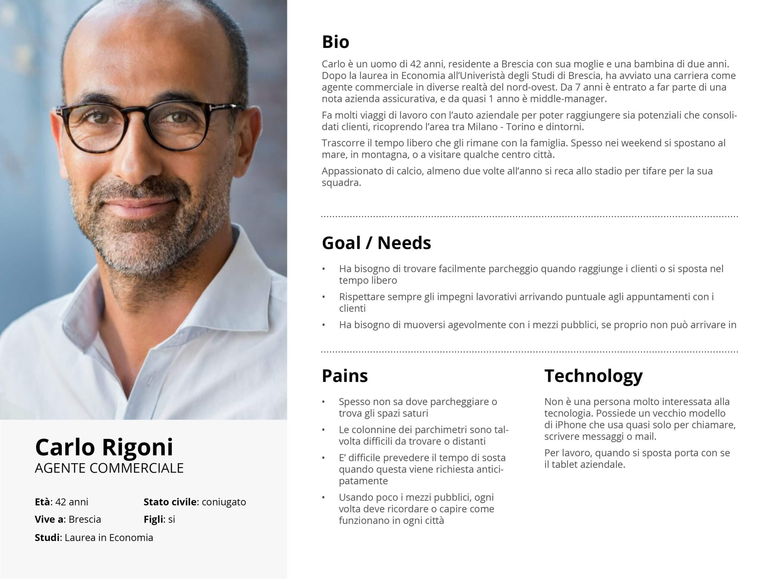
02 . 1 - PROTO PERSONAS
Who are the protagonists of this experience?
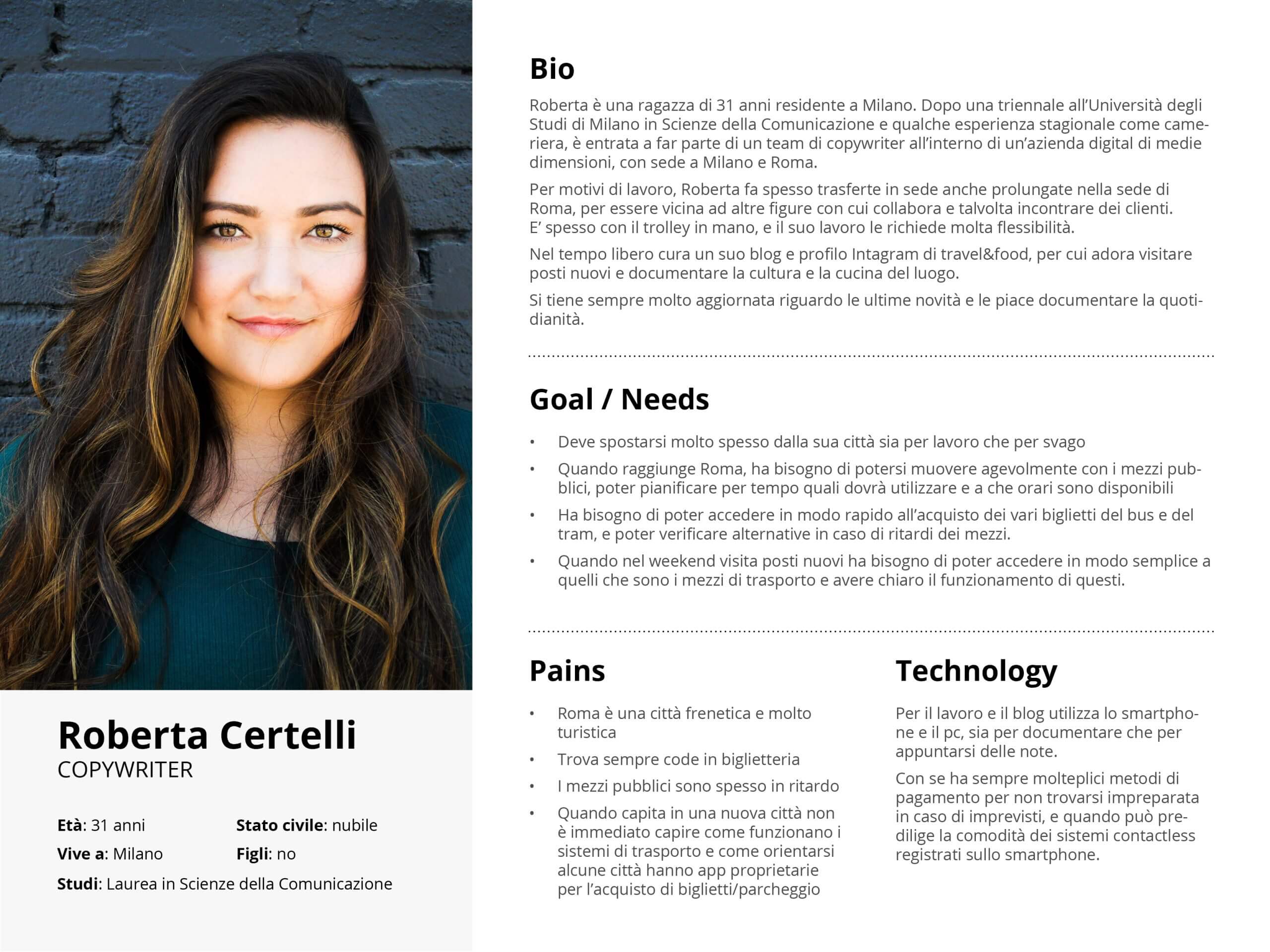
The analysis of the information collected allowed me to outline two Personas, with very different characteristics and needs:
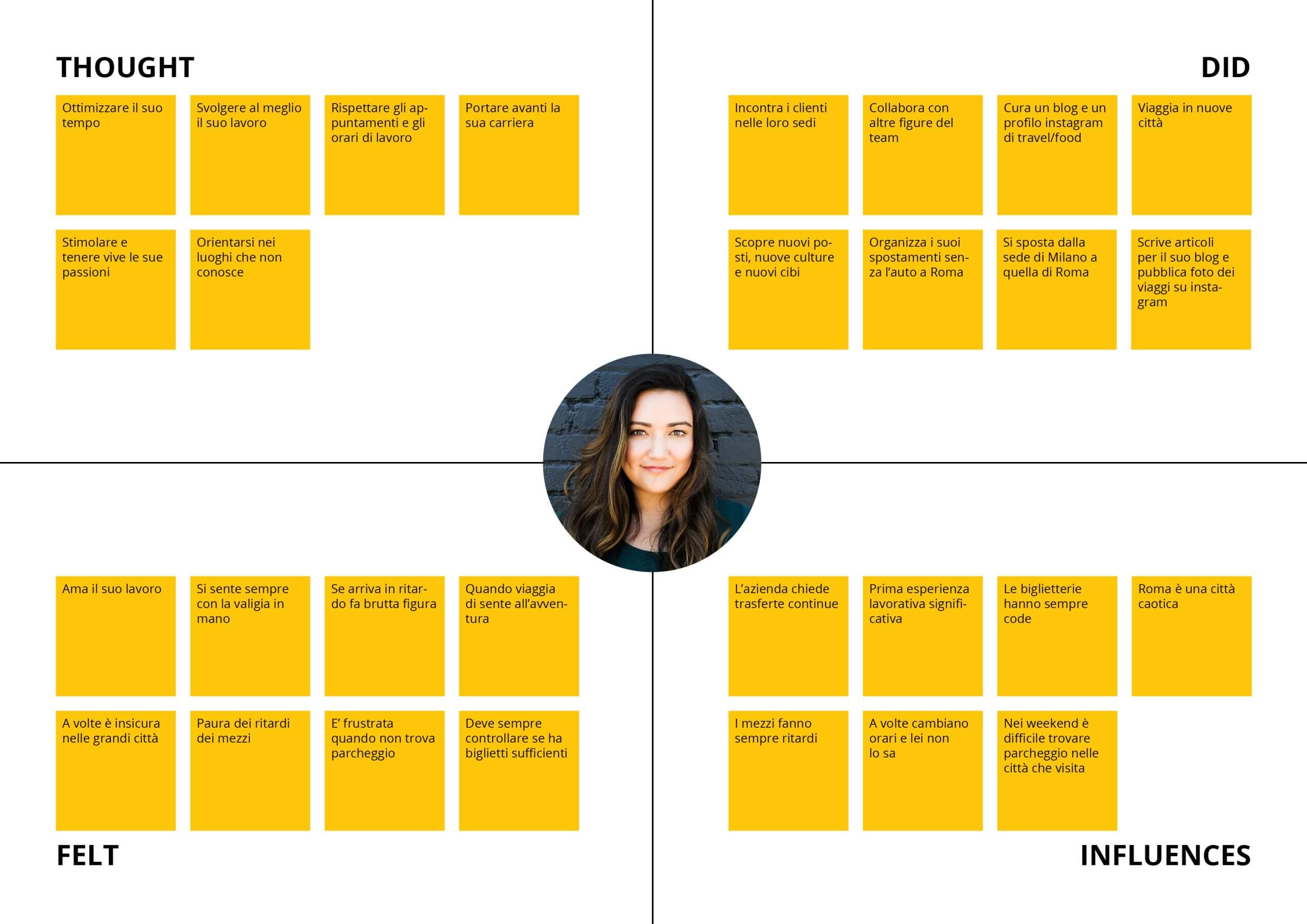
Roberta is a 31-year-old girl living in Milan, a professional copywriter who uses the app to purchase metro and bus tickets for her travels in Rome.
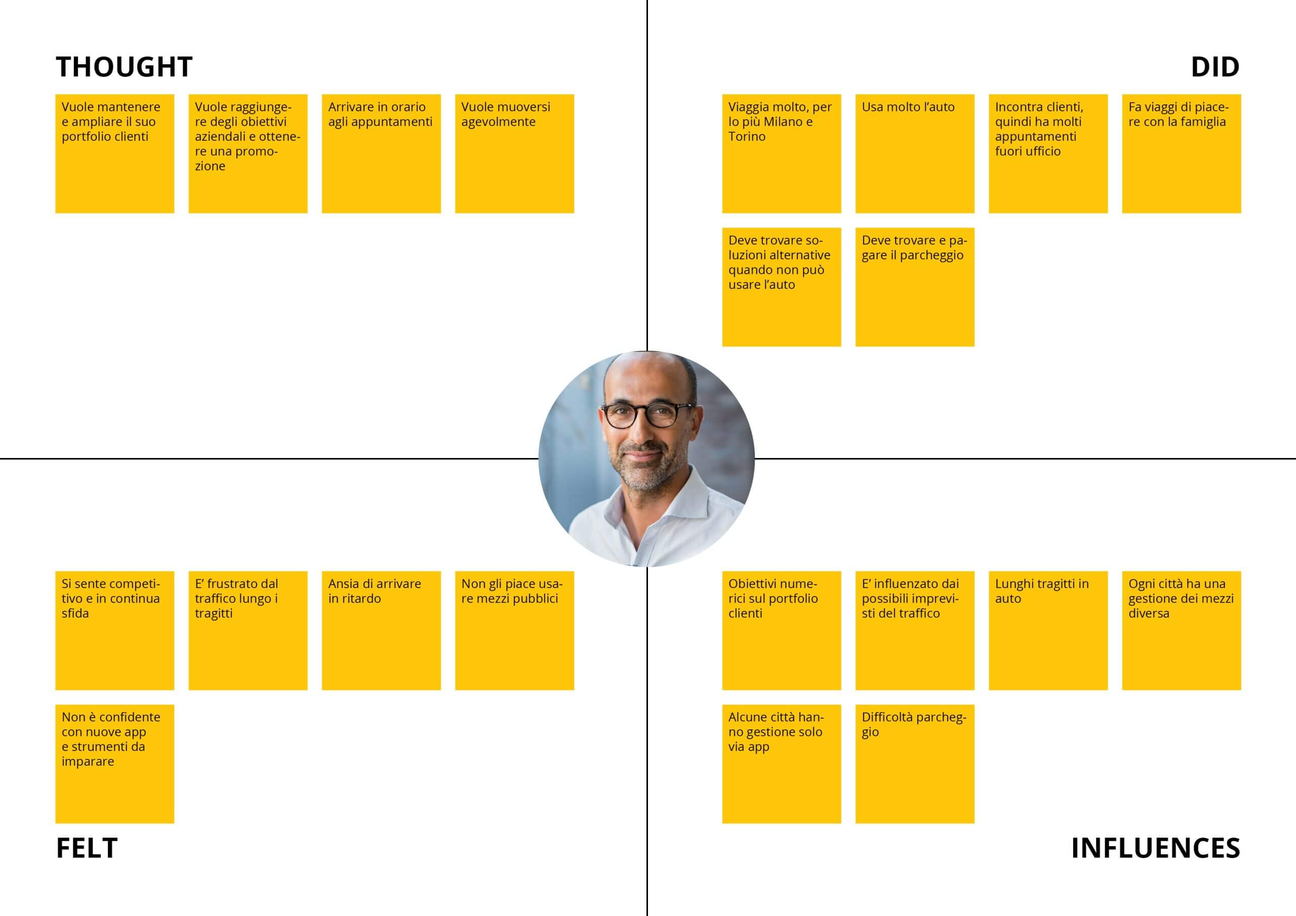
Carlo, on the other hand, is a 42-year-old man residing in Brescia, works as a commercial agent for his insurance company and uses MyCicero above all to park the company car in the blue stripes.
02 . 2 - EMPATHY MAP
What are their needs?
I made Empathy Maps for each Personas, and as the business progressed, Roberta and Carlo acquired elements that helped me to understand them more and more.
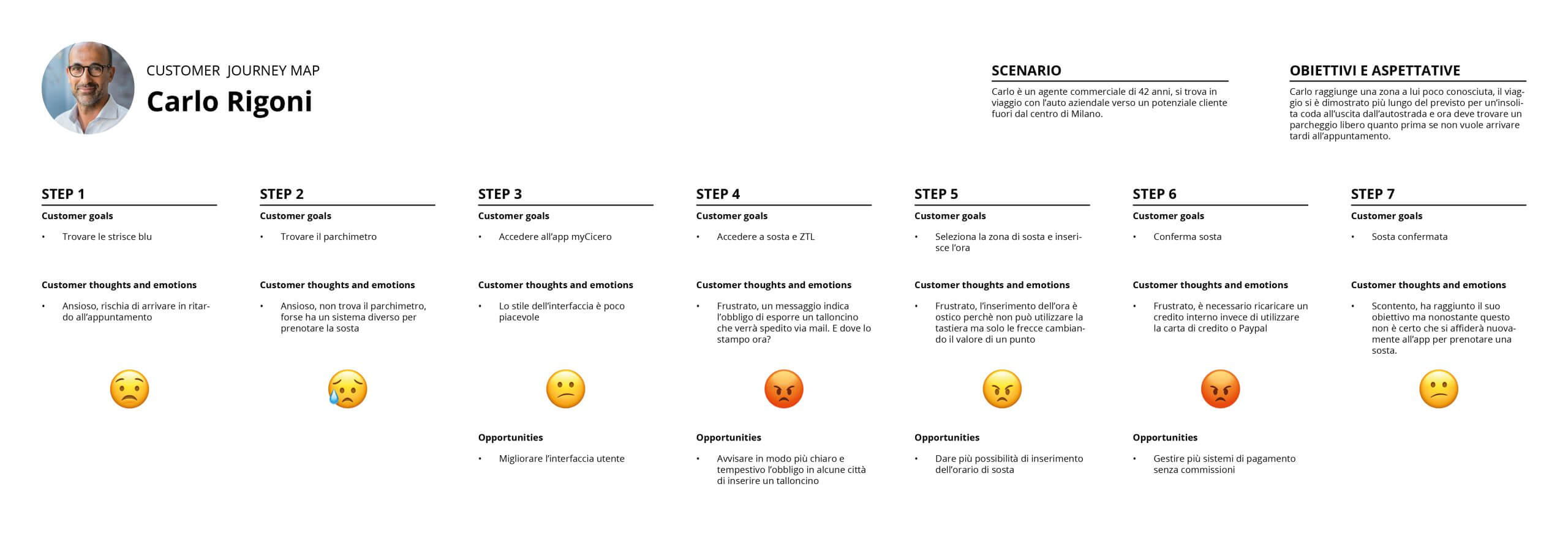
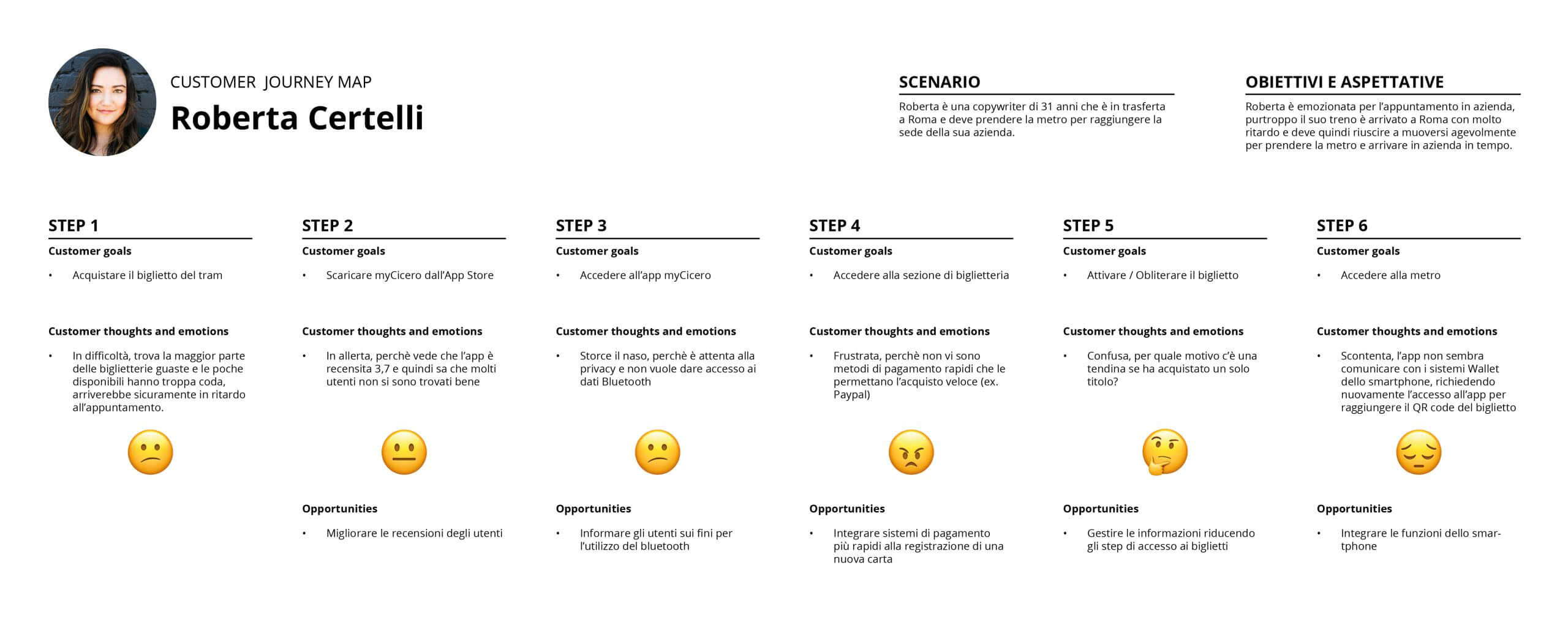
02 . 3 - USER JOURNEY
Create two stories that contextualize the app
Finally, I explored their experience with the current app by processing User Journeys and highlighting two different scenarios and tasks. For Roberta it is a question of buying a metro ticket and for Carlo of booking a stop on a blue striped parking lot.
02 - DEFINE
In summary, what are the problems?
Based on the information collected and the use of UX tools, it has therefore emerged that:
- The interface is not very intuitive and presents usability problems
- The compilation of data is complicated, especially the insertion of the timetable in the "Parking" section
- The categorization of the entries in Home is unclear
- Fast payment systems are missing (e.g. Paypal)
- The app does not communicate with the Wallet features (Apple, Google)
- Aesthetically it is not very pleasant
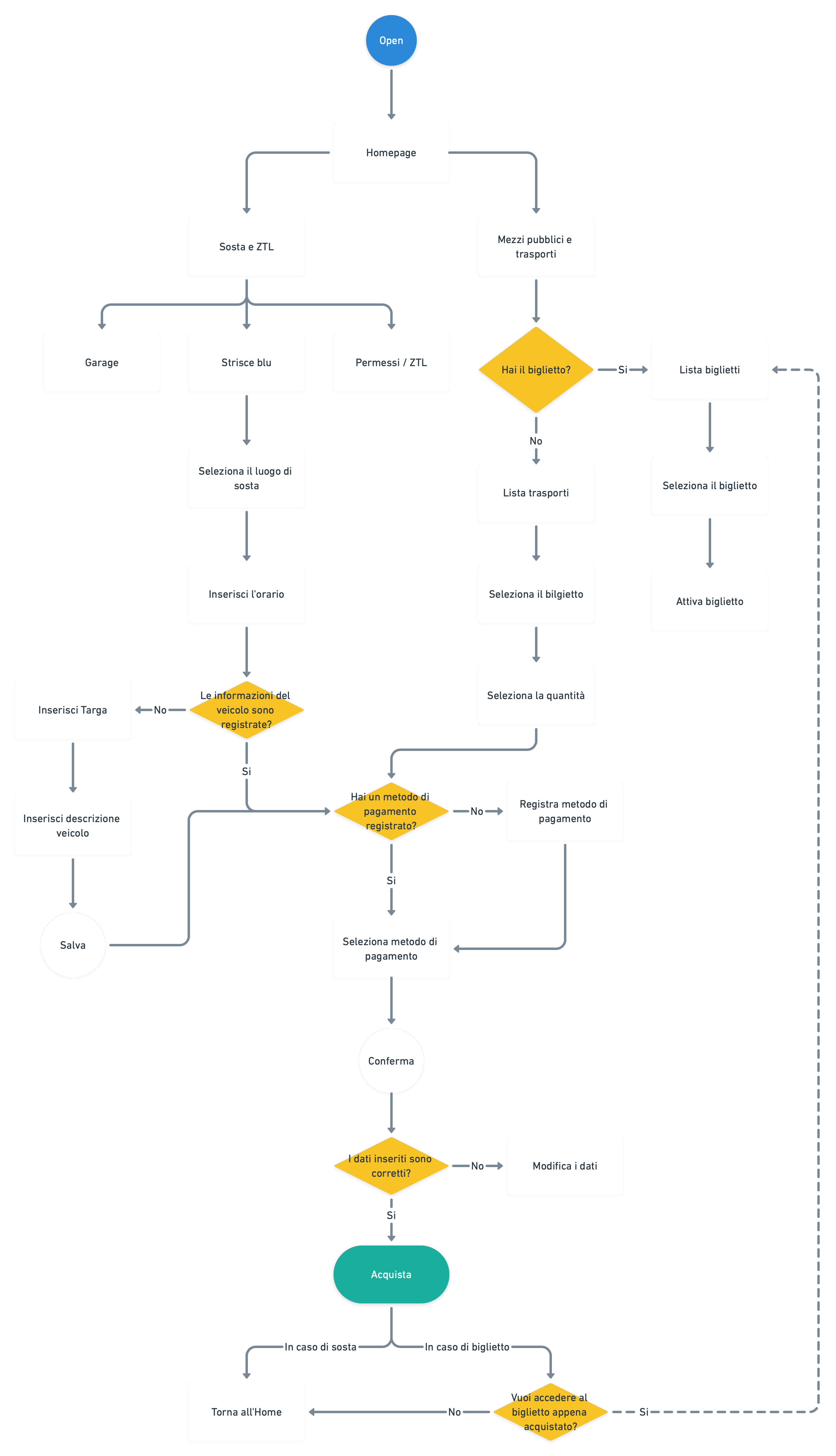
03 . 1 - USER FLOW
What could the new flow be?
The ideation phase begins with the re-elaboration of the flow of use of the app, to make the experience more fluid and simple, having in mind the tasks to be completed.
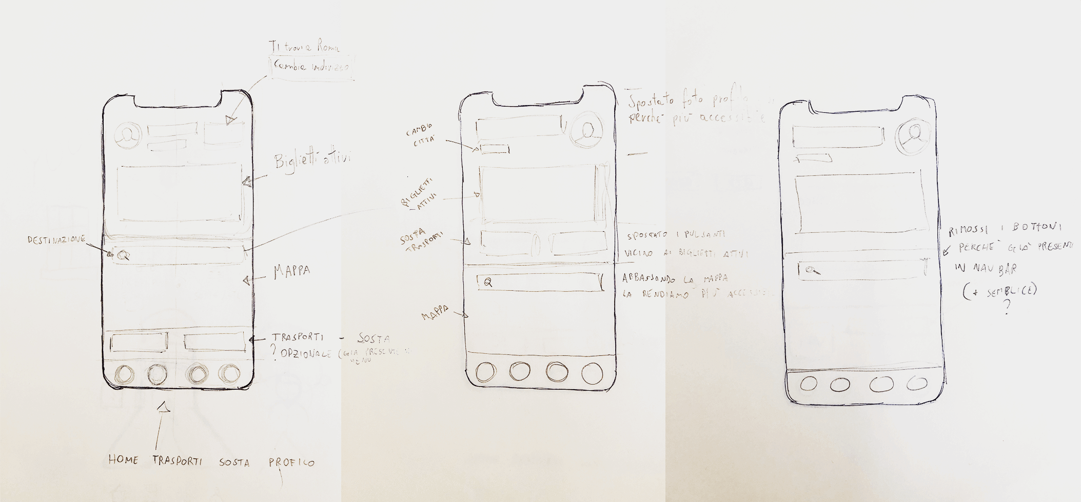
03 . 2 - SKETCH OF MULTIPLE SOLUTIONS
Explore multiple solutions to find the best one
Then I went to pen and paper to explore various proposals that resolved the defined problems, noting the differences and the impact they could have on navigation.
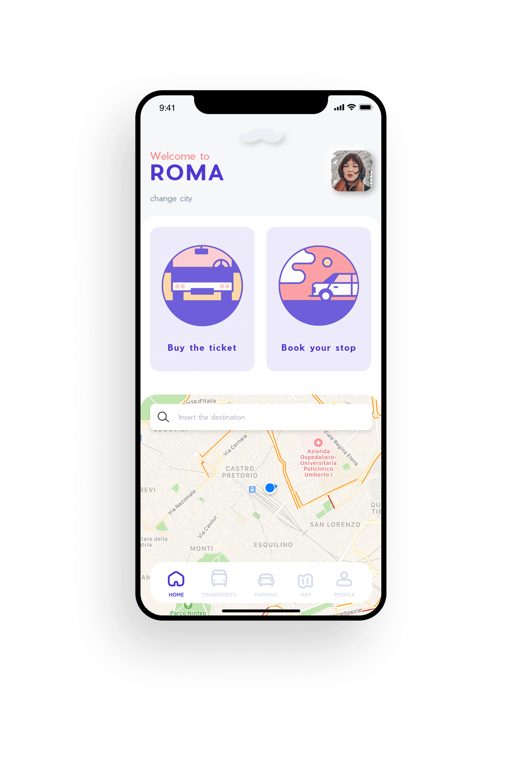
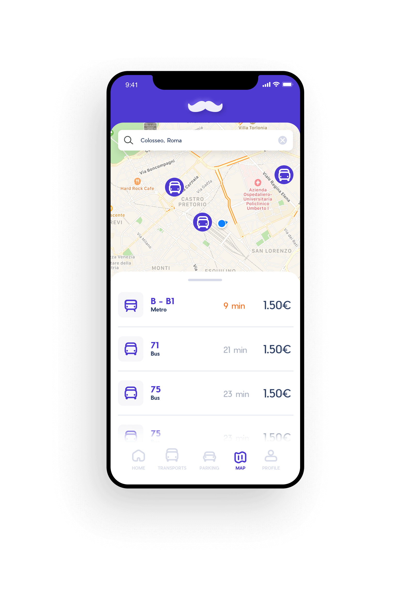
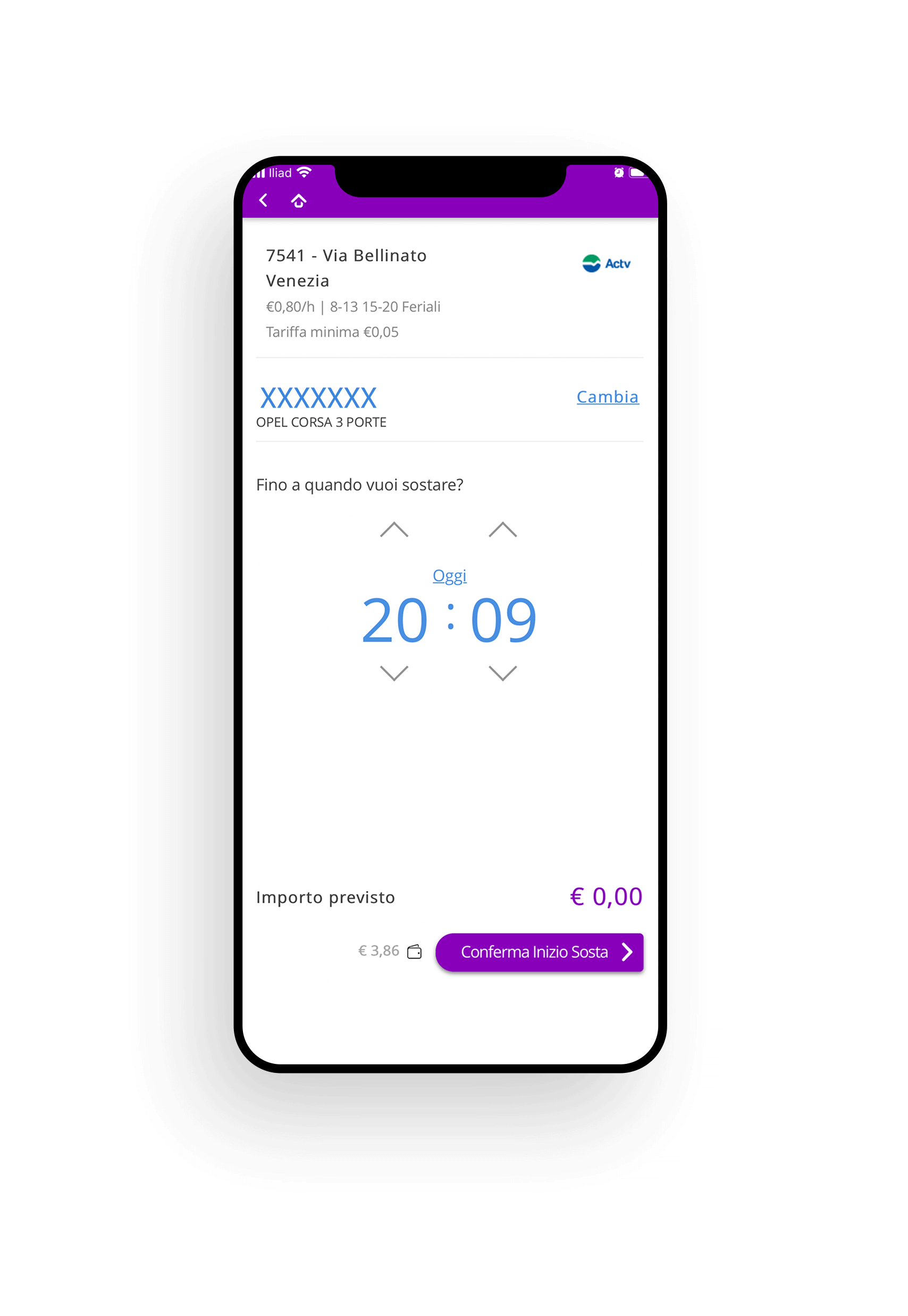
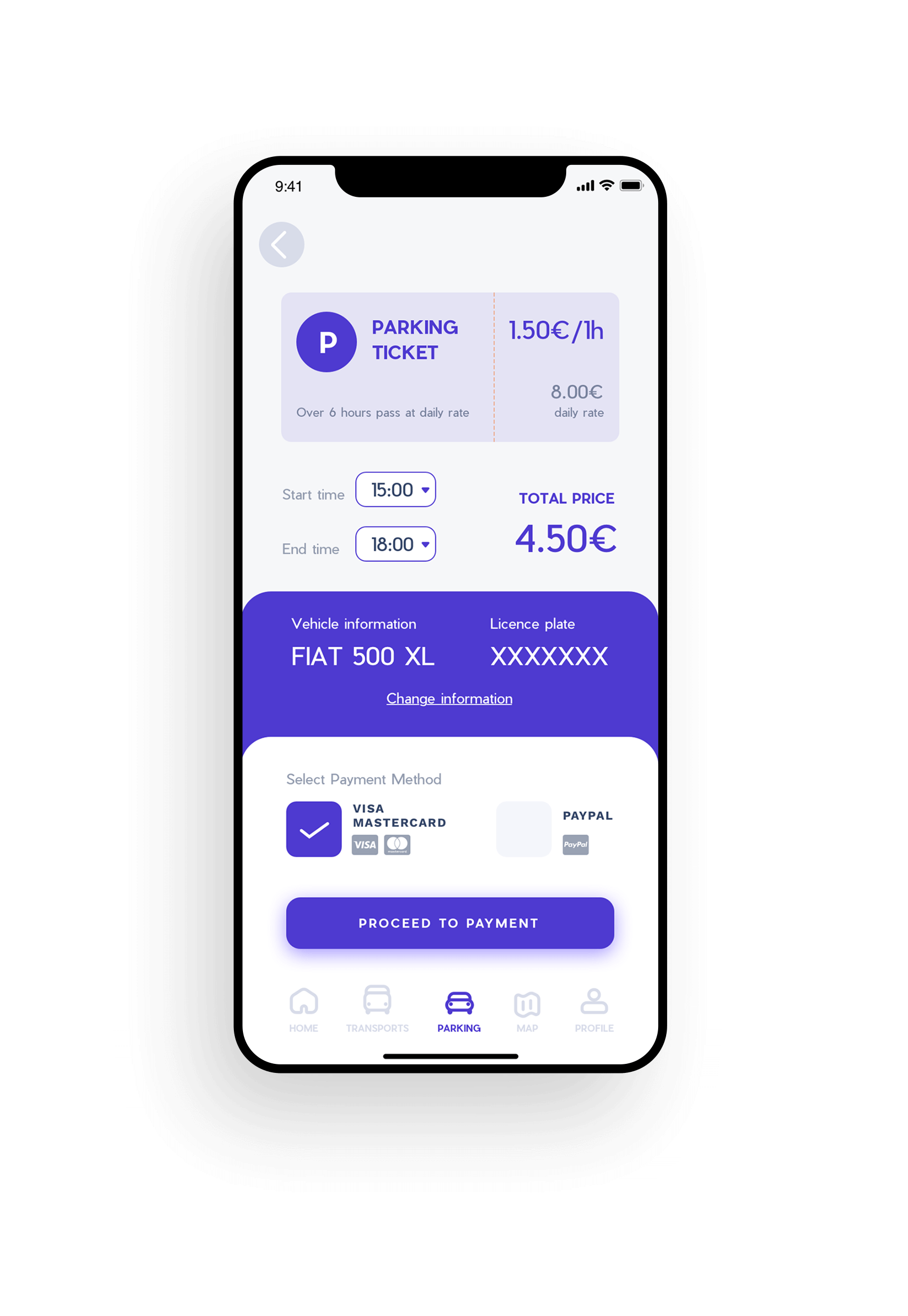
The new layout proposal, unlike the current solution, is not a division of functionality that the service can offer, but rather a division by goals. In the Define phase we saw what Roberta and Carlo's needs and objectives were, and on the basis of these I went to build the new interface which is divided into three navigation paths: Ticket Office, Parking and Map.
04 . 2 - TEST
Let's see how people use the new product
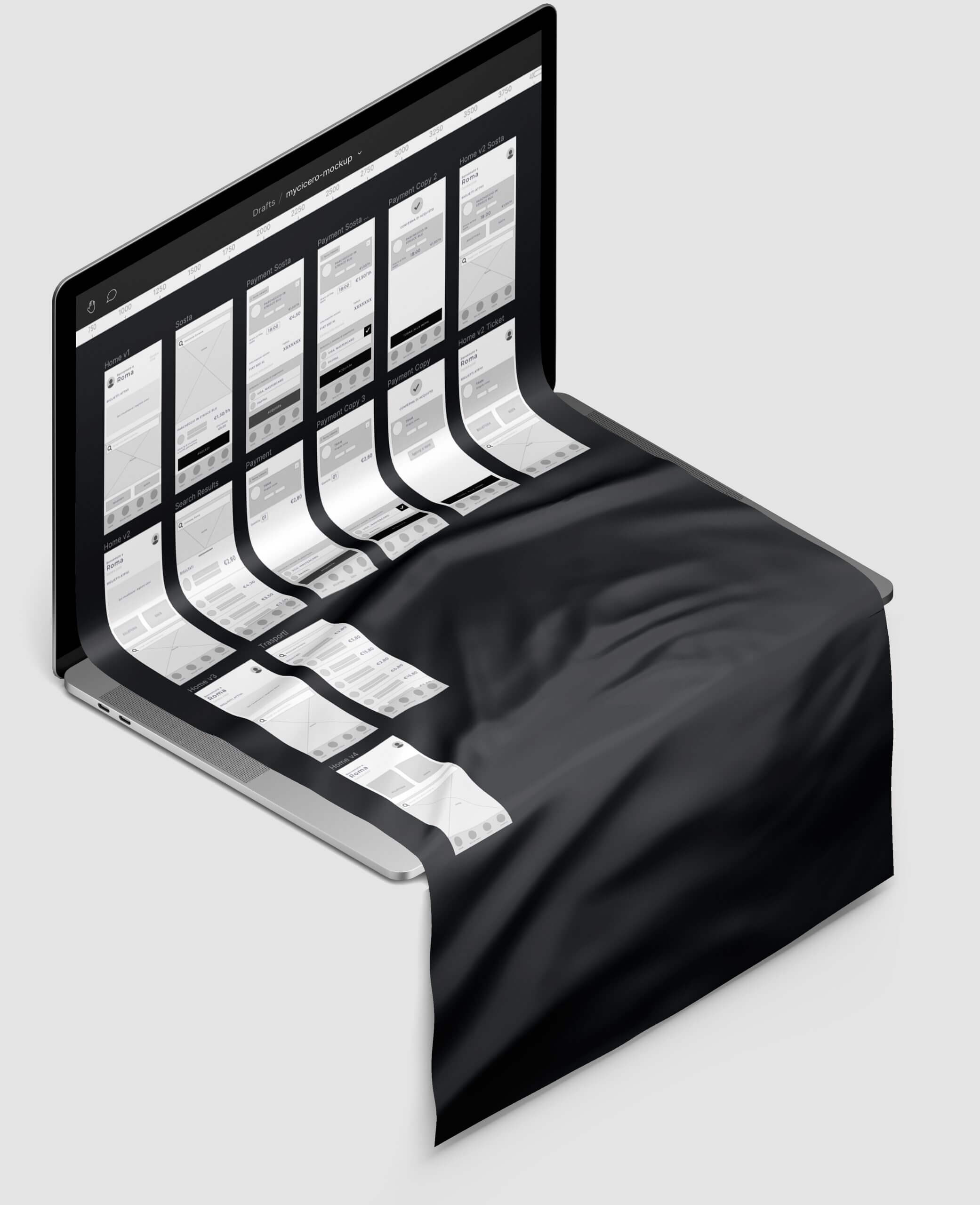
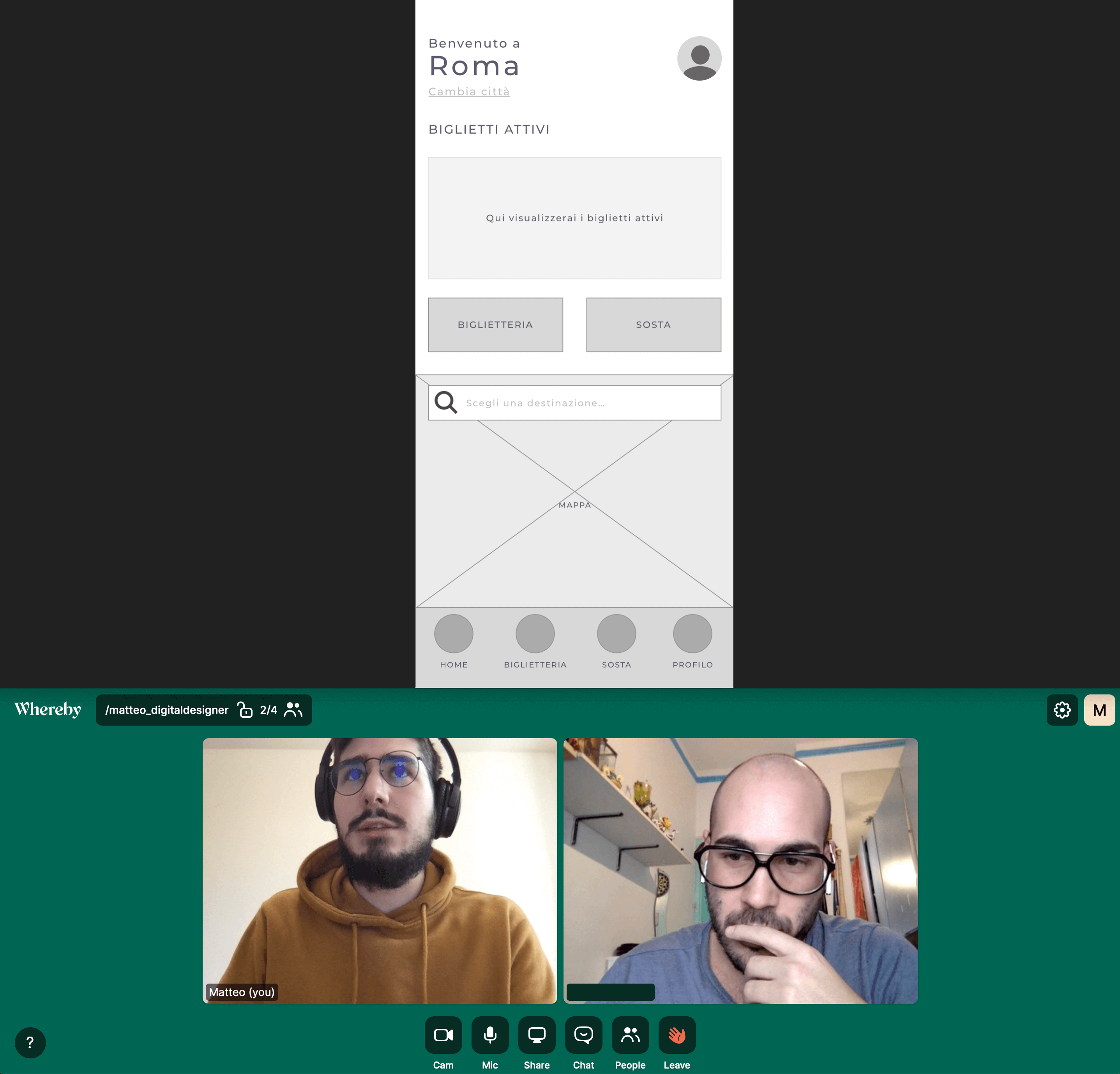
After exploring multiple solutions, I went to build low-fidelity prototypes in Sketch and started doing usability tests on 5 people.
Prototype and Test are the two phases in which I found myself having to go back more often, as the usability tests highlight new interface problems, especially in my case where the navigation flow has changed profoundly compared to the current solution.
Sometimes the test went smoothly. Other times, after a first hesitation, the user managed to reach the dedicated section, in still other cases he remained stuck in a point where he seemed unable to advance.
Returning to the prototyping phase and correcting the parts that were more complex allowed me to acquire greater awareness of the product, it is a self-analysis process that helps not only to remain well focused on the objective, but also not to take for granted that the solution that you are designing is the best for everyone.
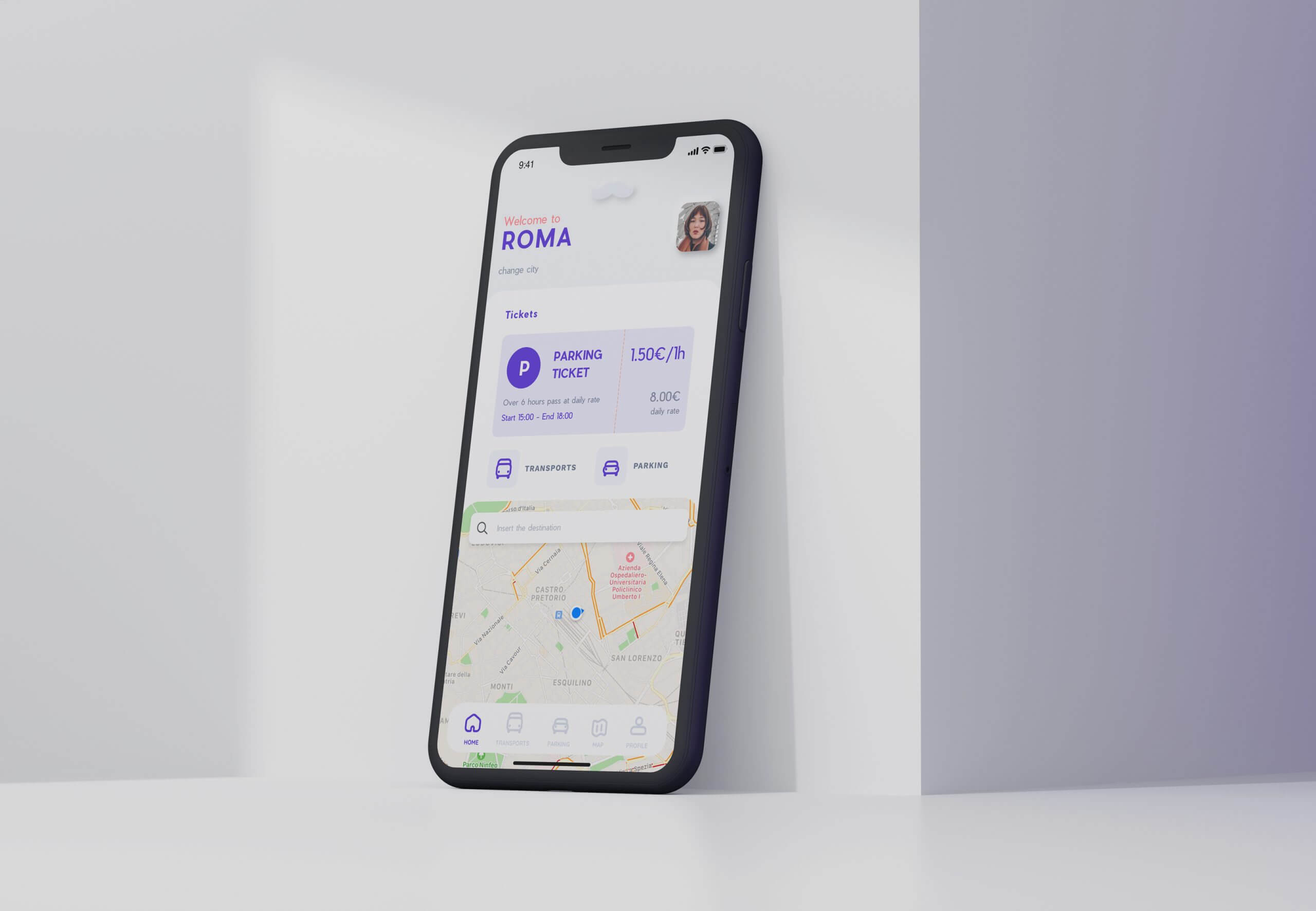
04 . 5 - VISUAL DESIGN
Once the solutions were validated, I continued with a complete restyling of the interface
I have collected the distinctive elements of the current MyCicero app, such as the logo mustache, and I have reworked them in a more modern way by choosing a lighter and more harmonious color palette that lends itself more easily to a possible Dark Mode version.
🙌