Luisa Spagnoli
ECOMMERCE - UI Design - 2021
✺
Luisa Spagnoli, from the invention of the Bacio Perugina to the clothing brand
PROJECT GOAL
Luisa Spagnoli, a leading women's clothing brand, boasts a rich heritage dating back to the early 1900s. Founded by the visionary Luisa Spagnoli, the brand is renowned for its innovative use of angora wool.
This project focused on the development of their e-commerce website, aiming to establish a foundational design language that would be echoed across all of Luisa Spagnoli's digital touchpoints. In essence, the website would serve as the cornerstone of a cohesive brand experience.
01
Research
1. Desk Research
2. Positioning brand analisys
3. Competitor analisys
4. Stakeholders interview
02
Define
1. Moodboard
2. Look & feel
03
Ideate
1. Typography
2. Color Palette
3. Icons
4. Definition boards
5. Prototype
01 . 2 - POSITIONING BRAND ANALYSIS
Understanding the Needs
Every project is driven by specific requirements. To gain a comprehensive understanding of the project goals, we conducted a series of brief interviews with key stakeholders. These sessions focused on gathering their objectives and expectations.
We also engaged in a collaborative analysis of Luisa Spagnoli's current digital communication landscape. This joint exploration helped us define target aspirations and identify areas for improvement.
Based on these discussions, we established a preliminary set of objectives. However, we maintained an open and receptive mindset throughout this phase, actively seeking to collect not only visual references but also insights into broader communication strategies and potential brand touchpoints beyond the immediate project scope.
02 . 2 - LOOK & FEEL
Two explorations that meet in an amazing result
Following the requirements gathering phase, we embarked on an individual exploration stage as a design team. Our goal was to delve into diverse creative territories without prematurely biasing our approach to the project.
This involved independently collecting inspirational materials – images, color palettes, illustrations, and photographic references – to inform the development of a stylistic direction. We also conducted initial design explorations, experimenting with various visual applications.
Through this independent exploration, we sought to identify potential design paths beyond the initial constraints of the requirements.
After this independent exploration phase, we reconvened as a team to share our individual design explorations. These initial explorations, while distinct from each other, revealed a fascinating array of stylistic interpretations of the project. Interestingly, we also identified underlying commonalities across the various approaches. Leveraging this shared understanding, we collaboratively refined the design vision, ultimately converging on a unified and well-defined stylistic proposal.
03 . 4 - DEFINITION BOARDS
Embracing collaboration and transitioning to Figma
Staying informed about the latest design tools is crucial. While many offer similar functionalities, each has unique strengths that can optimize workflows for specific projects. In this case, I'm proud to have spearheaded the transition from a local workflow using separate Sketch files to a collaborative remote environment with Figma.
This shift proved to be a pivotal moment for our team. Figma's real-time collaboration features not only streamlined our workflow but also perfectly suited the demands of a remote work environment necessitated by the pandemic. The project's success on all fronts is a testament to the effectiveness of this transition.
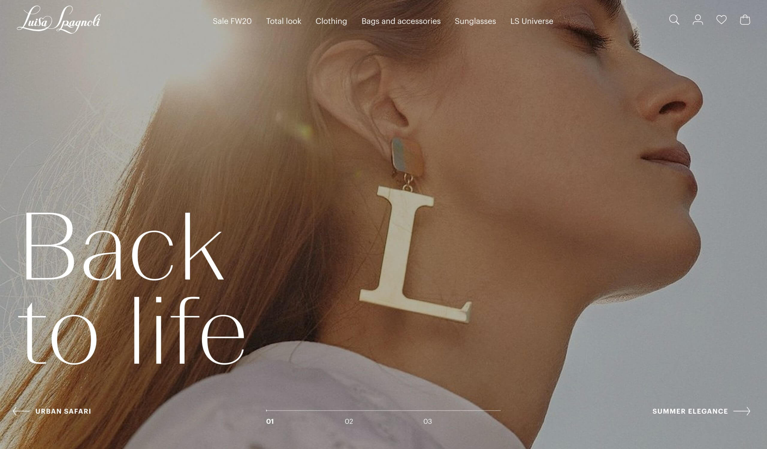
BIGHERO IN HOMEPAGE
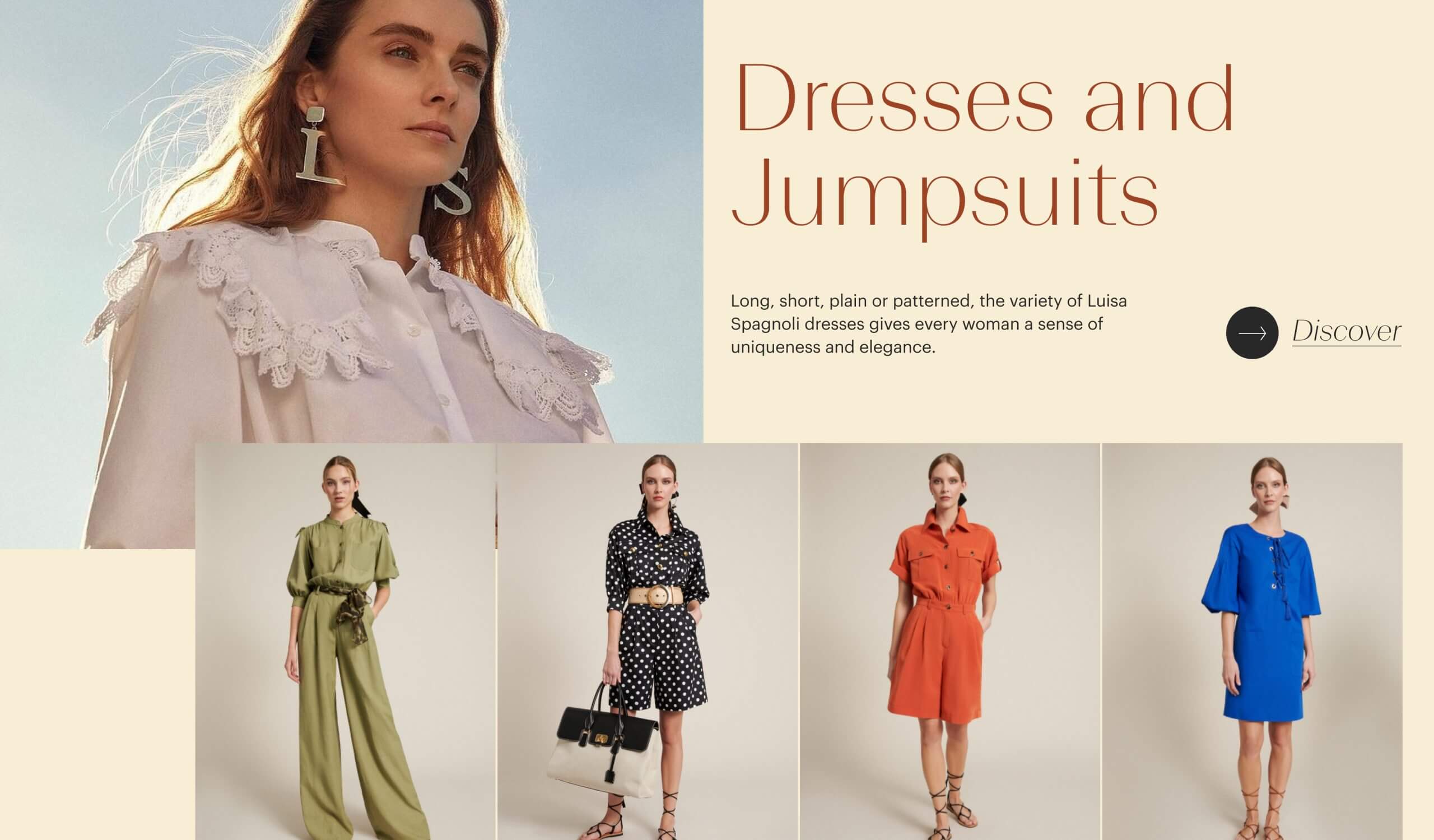
CATEGORY WIDGET IN HOMEPAGE
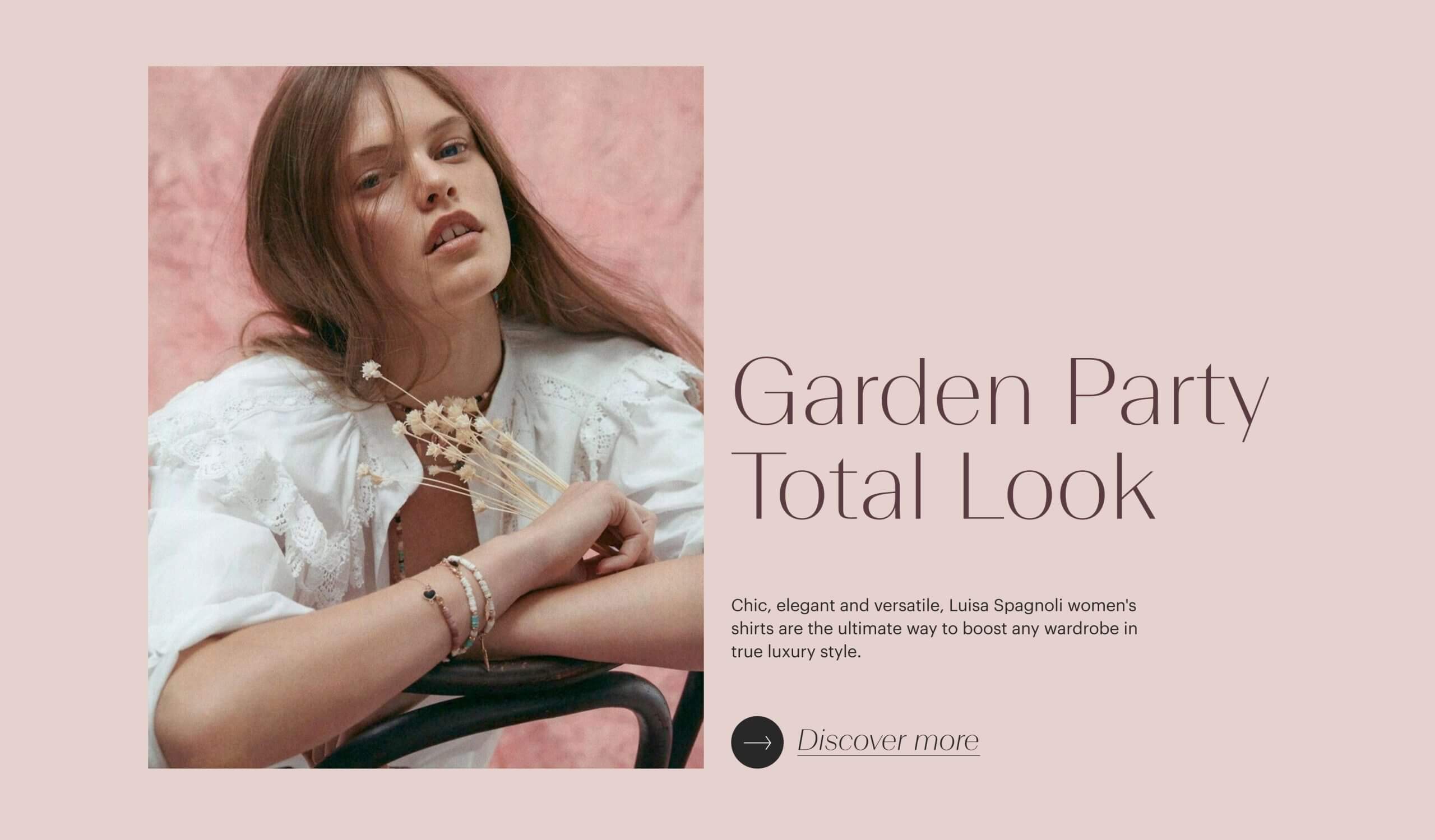
EDITORIAL WIDGET IN HOMEPAGE
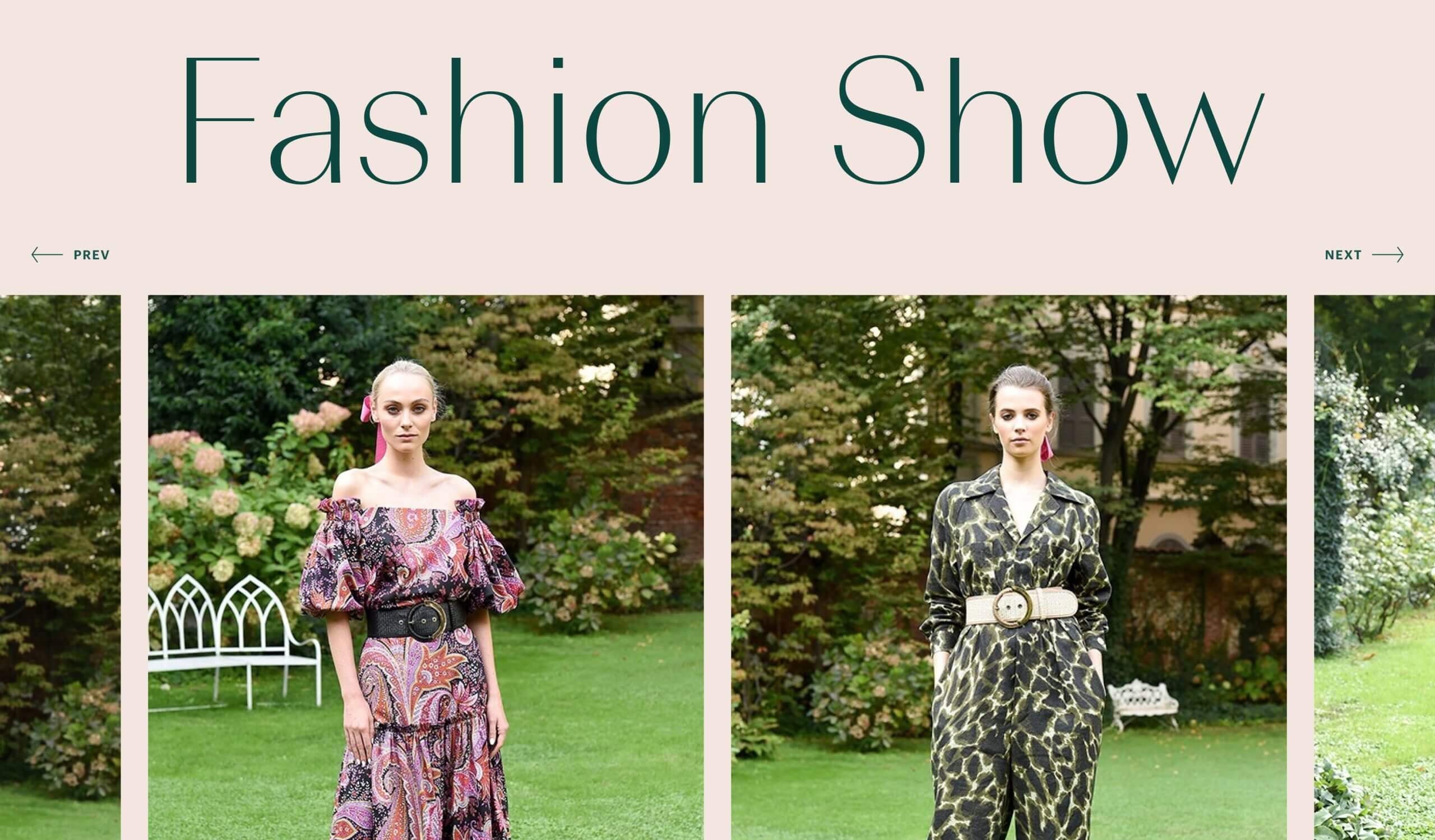
FASHION SHOW IMAGE SLIDER
03 . 4 - DEFINITION BOARDS
An editorial style that changes pace with colors
Our competitive analysis revealed a prevailing trend of minimalist black and white e-commerce websites within the luxury fashion sector. This homogeneity often resulted in impersonal and indistinguishable online experiences.
To ensure that Luisa Spagnoli's brand identity would shine through, we deliberately avoided this visual trap. Instead, we opted for a unique approach that leveraged the brand's inherent vibrancy.
We drew inspiration from the rich color palettes present in Luisa Spagnoli's clothing collections. By carefully sampling these colors, we created a dynamic color scheme. This strategy formed the foundation for a captivating user experience, featuring a subtle yet impactful background color transition triggered by user scrolling.
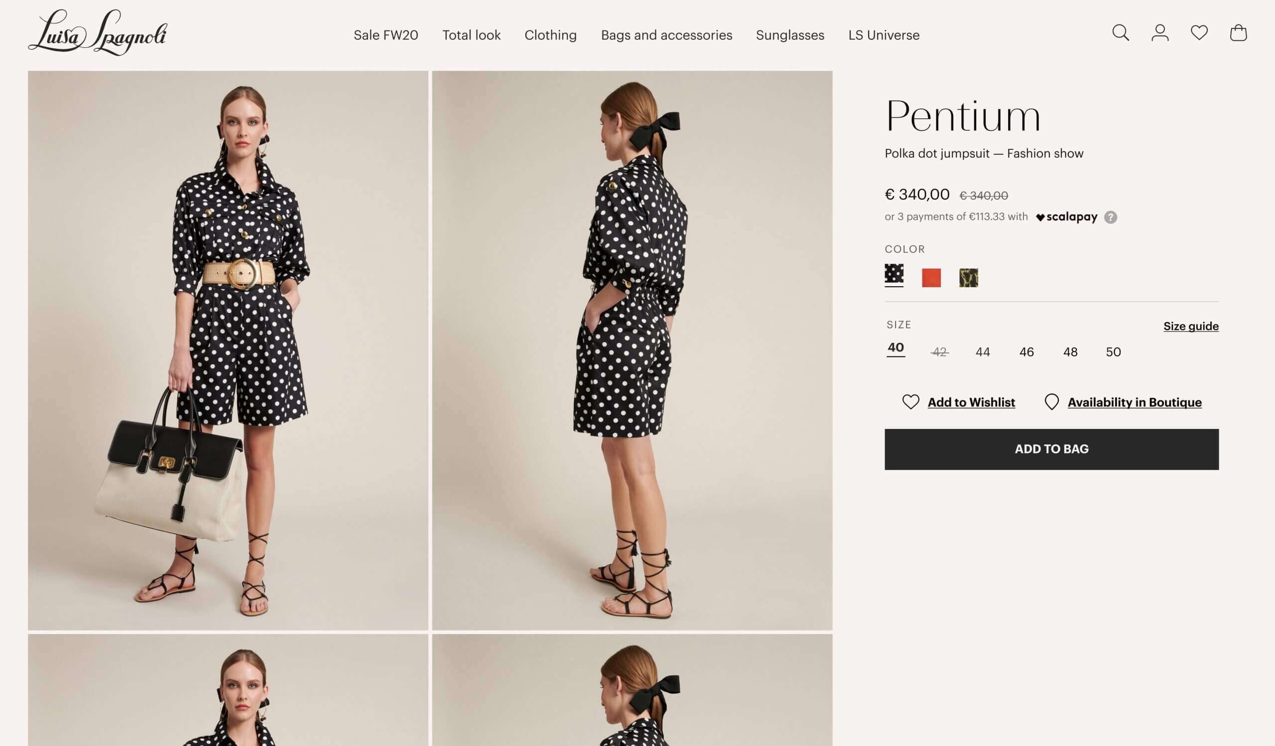
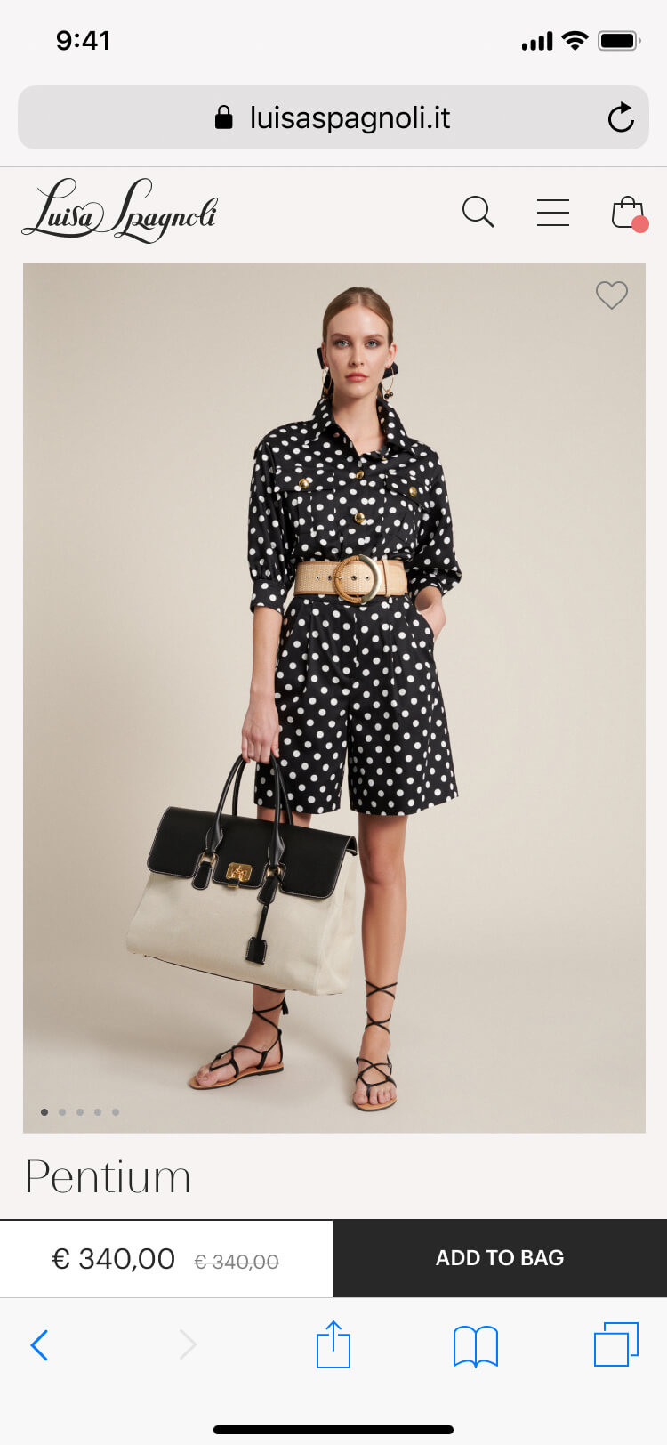
PRODUCT PAGE VIEWPORT
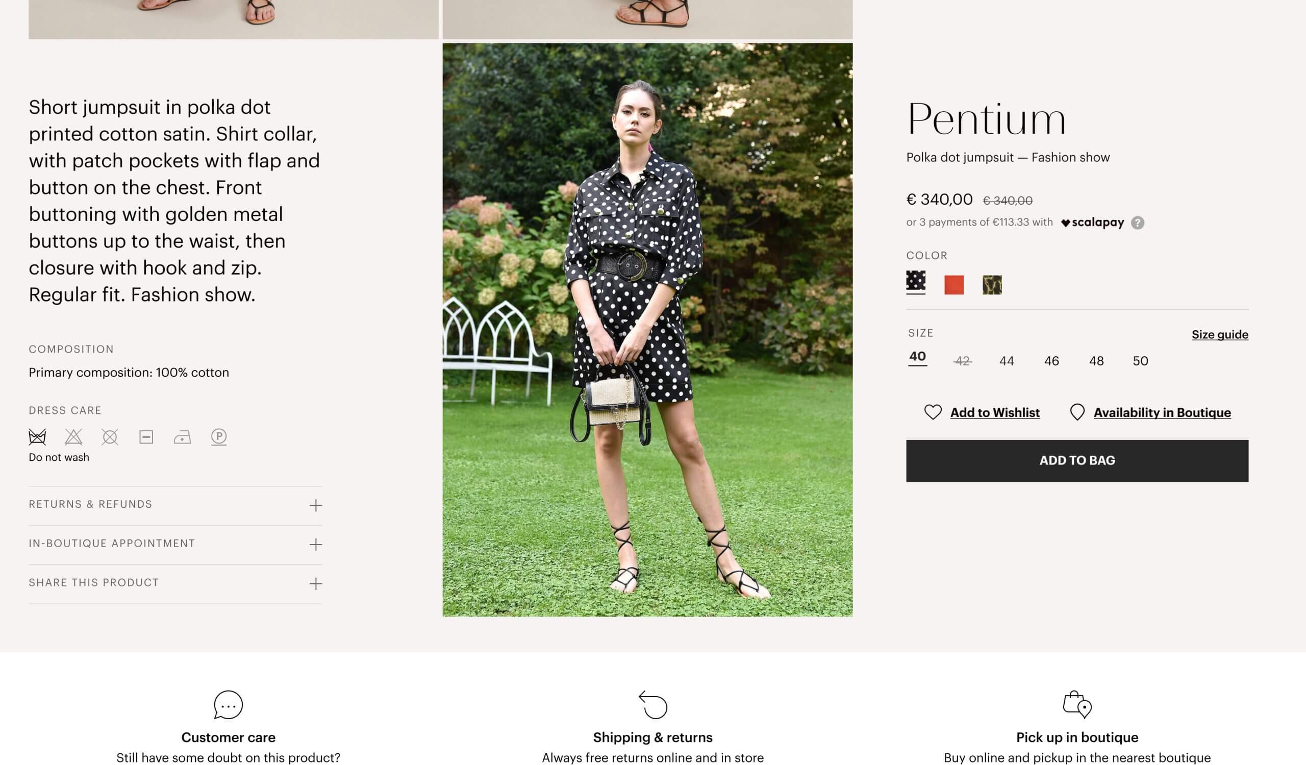
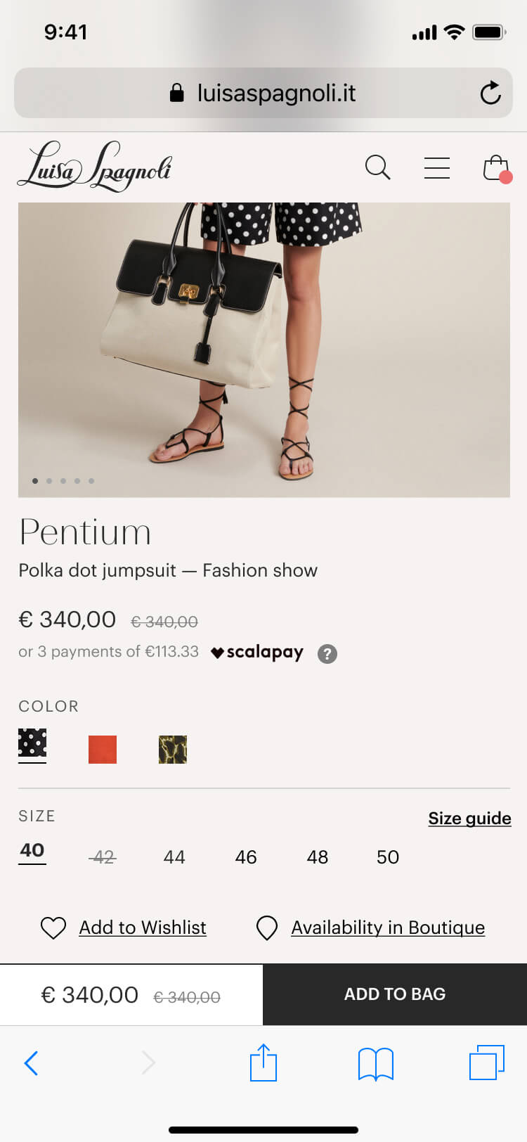
PRODUCT PAGE SCROLLED
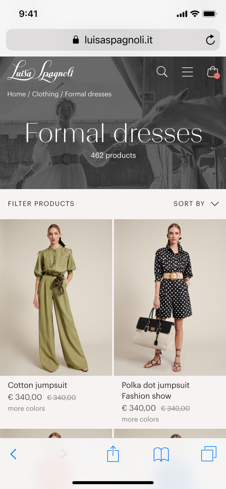
PRODUCT LISTING PAGE
PRODUCT PAGE VIEWPORT
PRODUCT PAGE SCROLLED